Marson Elk Lake
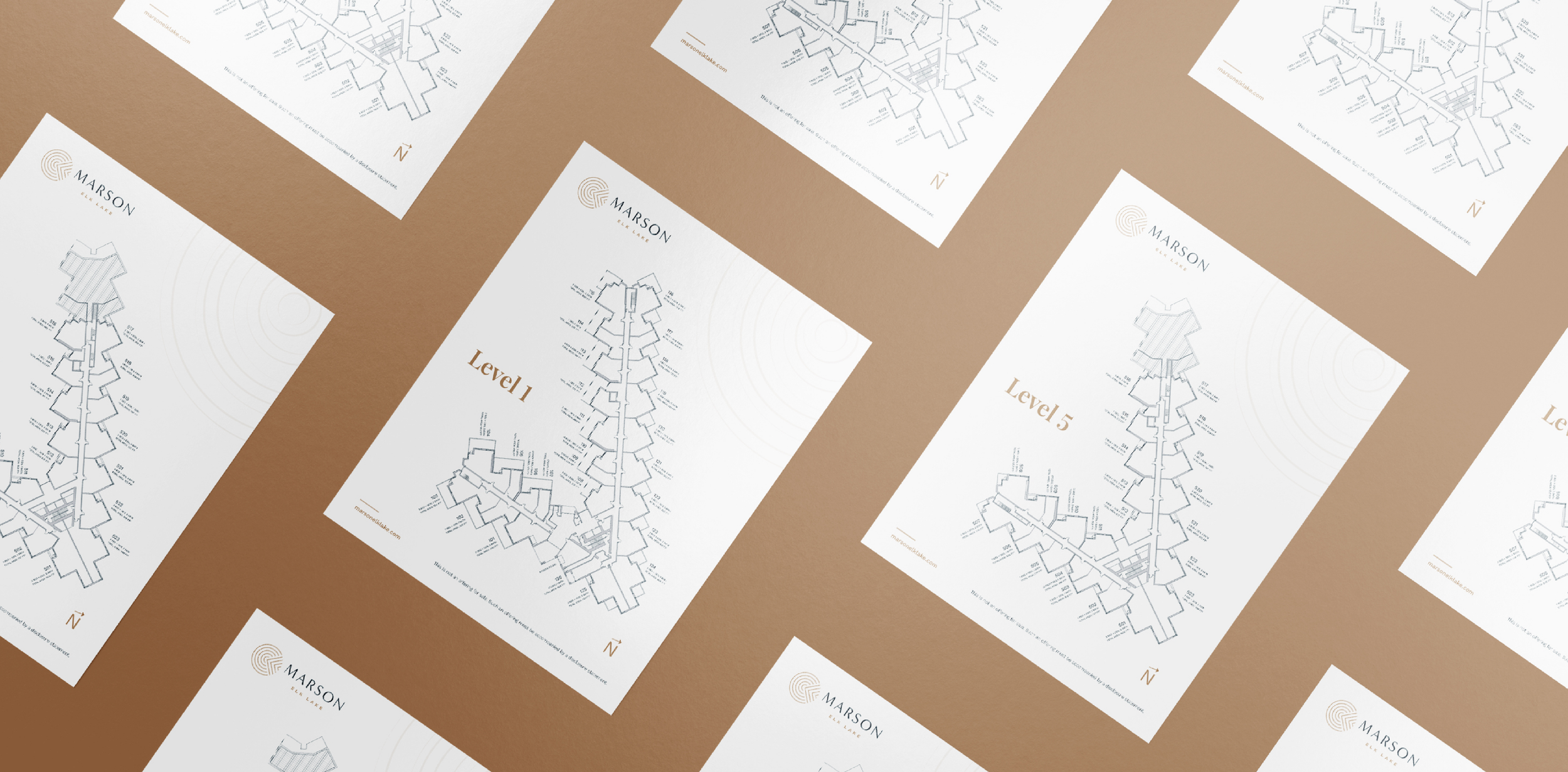
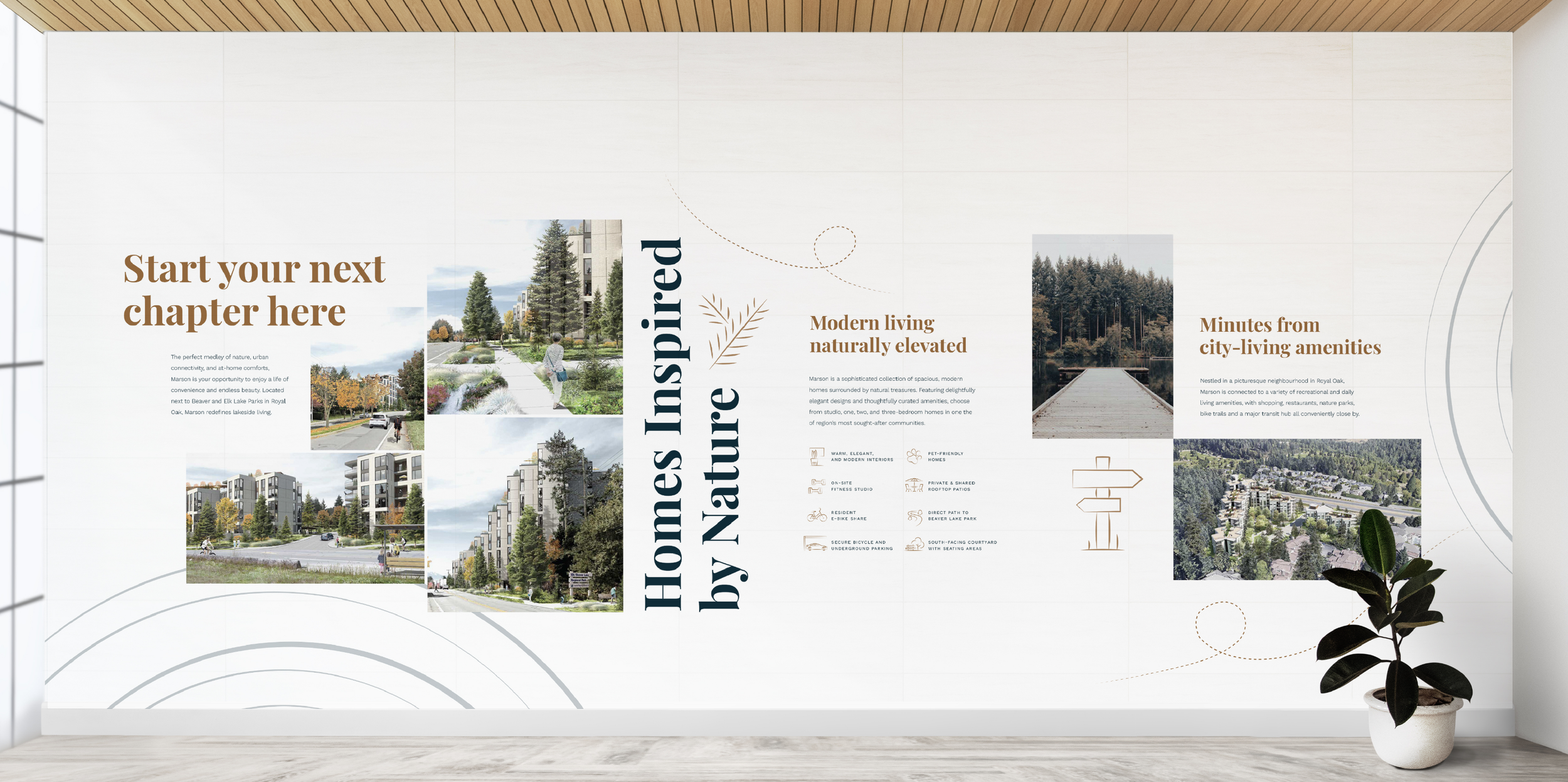
BriefMarson Elk Lake is a new condo development located alongside Beaver Lake Park in Victoria. The architecture features a distinctive V-shaped form designed to sit in harmony with the surrounding natural landscape.
The goal was to create a cohesive brand identity that reflects this connection to place, evoking a sense of calm, modern living rooted in nature.
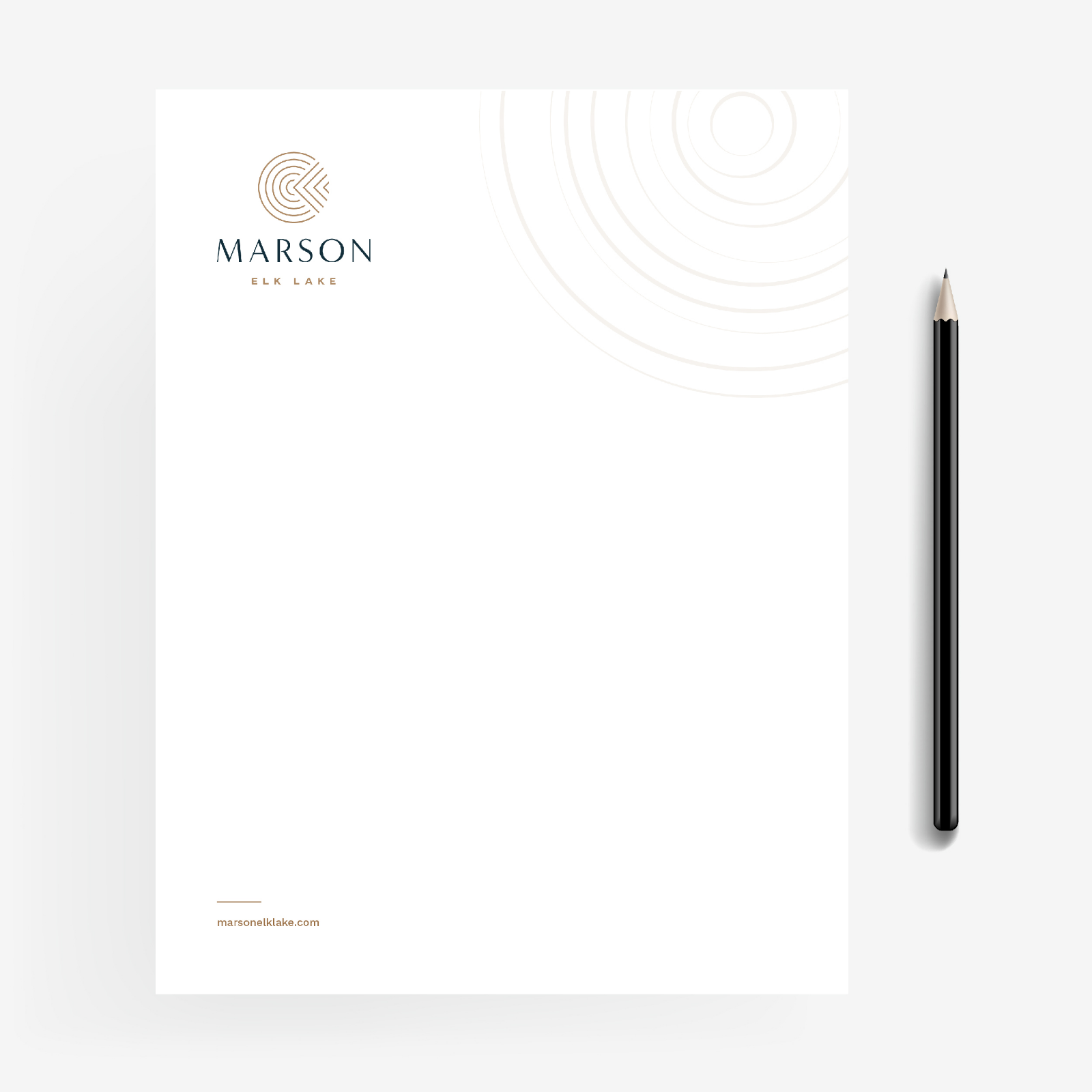
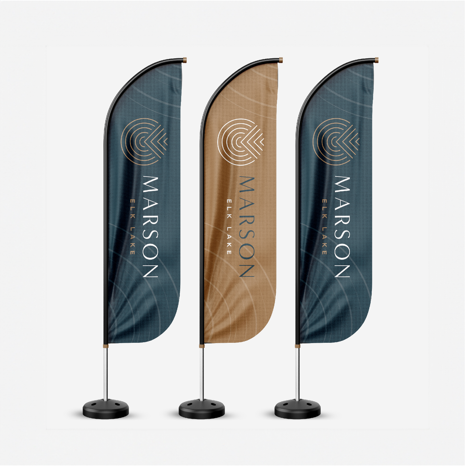
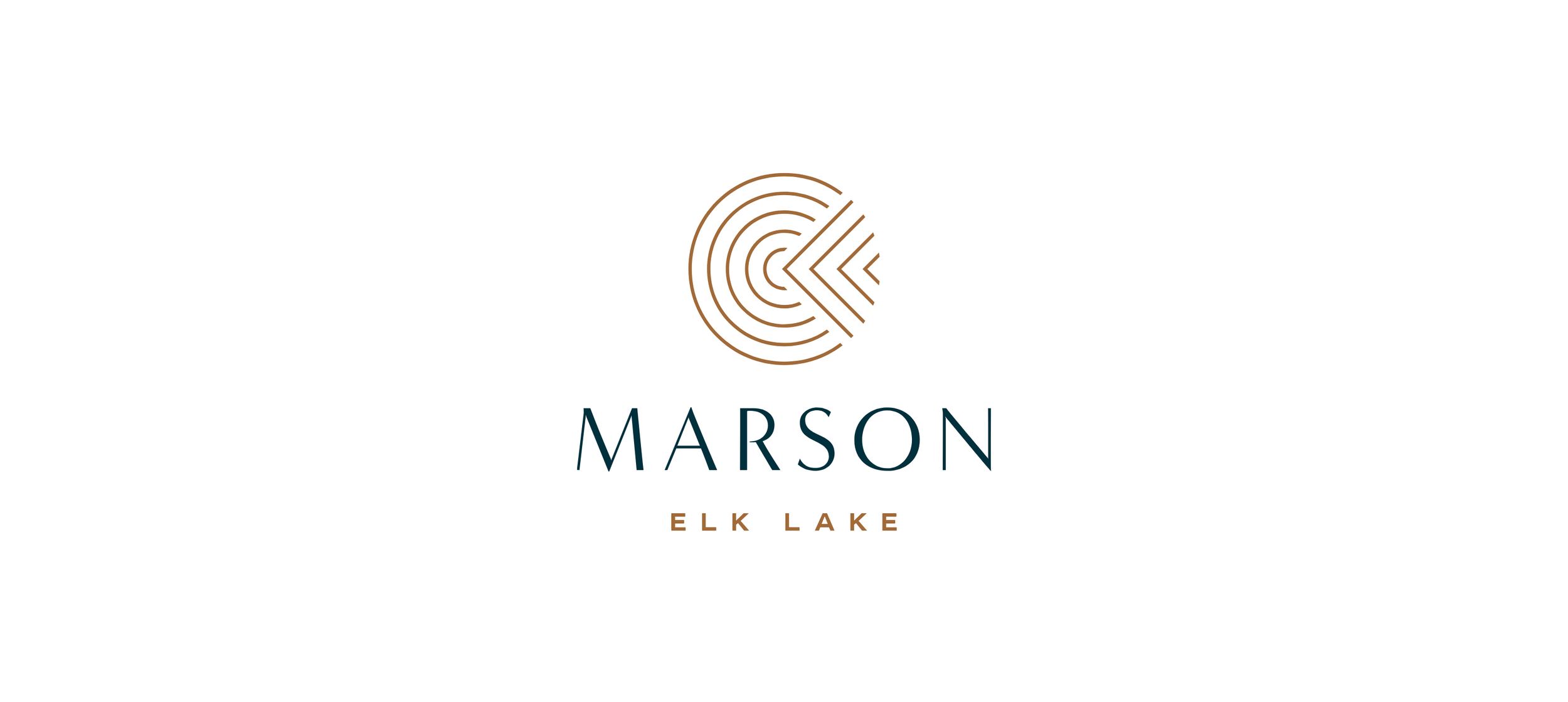
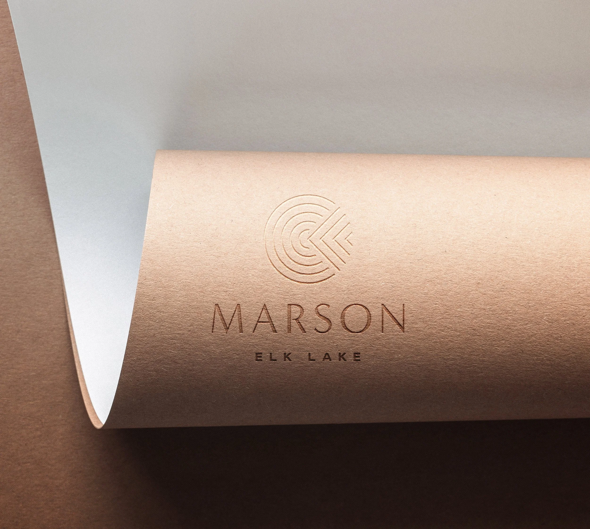
The approachThe identity centers on a circular emblem intersected by a V-shaped cutout, referencing both the architectural footprint and the development’s location within the landscape.
The circle represents the surrounding wilderness, while the structured geometry of the V introduces a sense of precision and stability. Together, these elements express the balance between natural softness and architectural form.
Subtle supporting elements extend this idea, including a rippling circular motif inspired by Elk Lake, adding movement and reinforcing the connection to place.
Hand-illustrated icons were incorporated to bring warmth and contrast, softening the system and creating a more approachable, human feel.
The resultThe final identity balances clarity and character through a clean, cohesive visual system. The central mark anchors the brand with a distinctive symbol that reflects both the architecture and its surroundings.
A modern sans serif typeface with rounded finishes supports the identity, introducing a sense of ease while maintaining a refined, contemporary feel. A suite of supporting elements allows the brand to extend consistently across marketing materials.
Work created as designer at Array Studios as part of a collaborative process.
colour paletteThe Marson Elk Lake color palette is anchored by a deep teal blue, which evokes feelings of tranquility and serenity, reminiscent of the calm, still waters of Elk Lake. In contrast, a rich golden earth tone embodies the warmth of sunlight, providing a comforting and familiar touch. This color brings to mind the gentle glow of sun-drenched landscapes, evoking feelings of joy and connection to the environment.
The harmonious combination of deep teal and golden earth tones conveys a sense of safety and calm, perfectly aligning with the development’s ethos of relaxed living. Together, these colors create a balanced and inviting aesthetic that encourages residents to embrace a lifestyle in tune with nature.