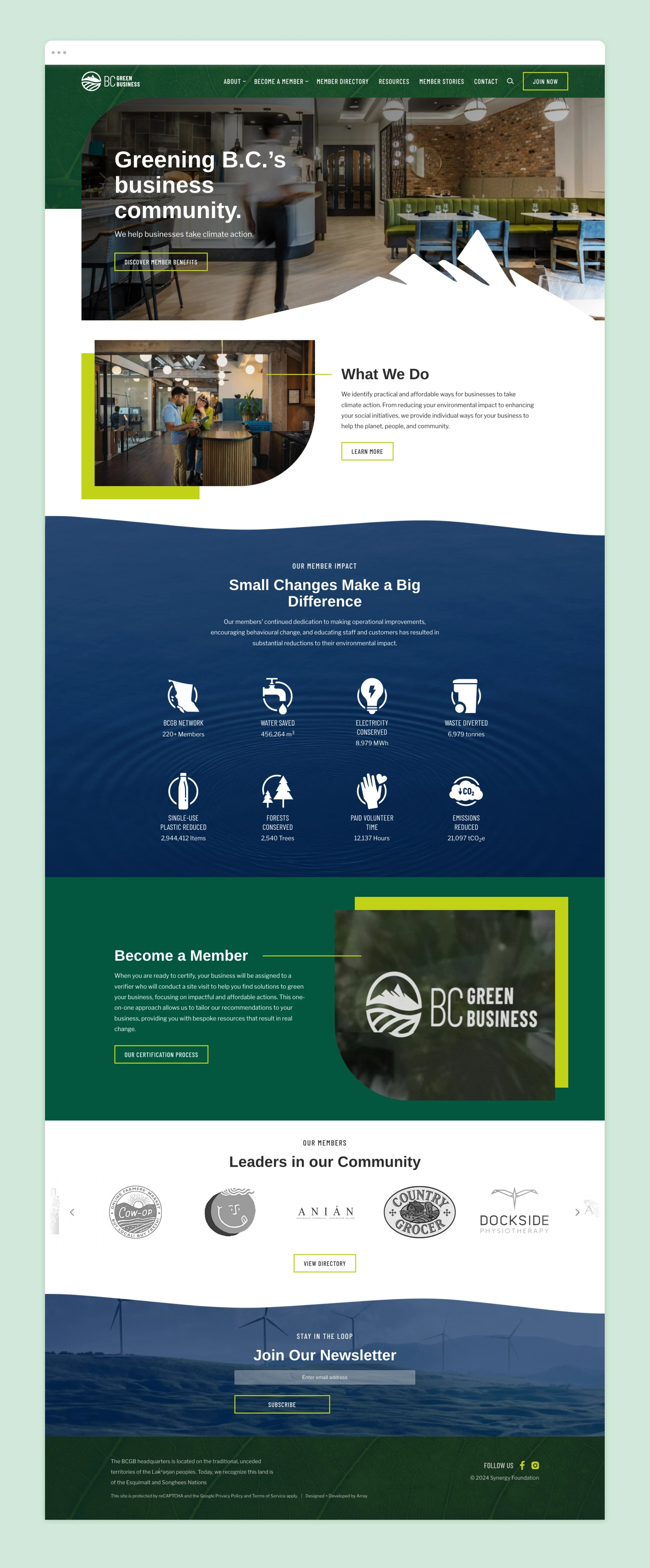
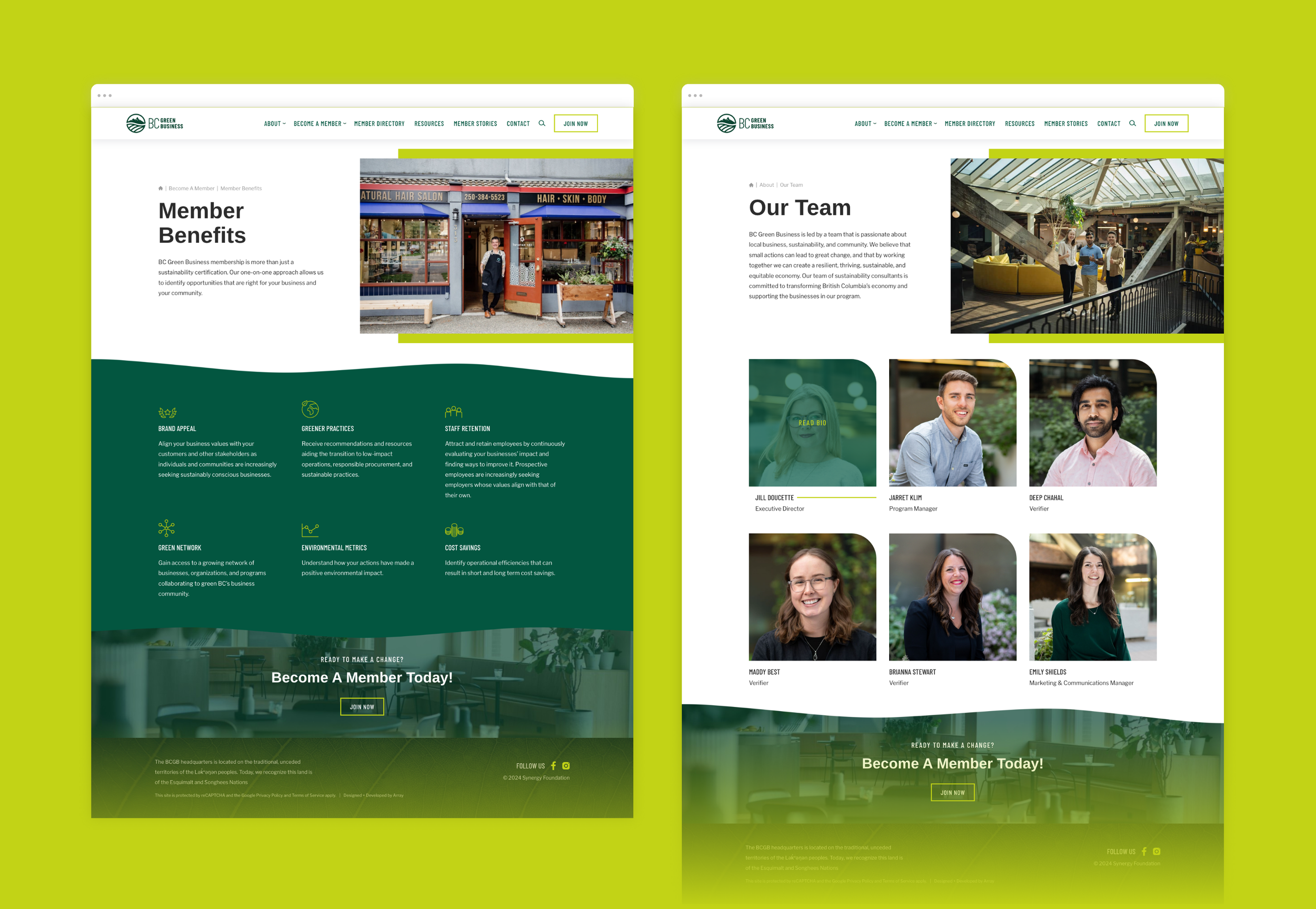
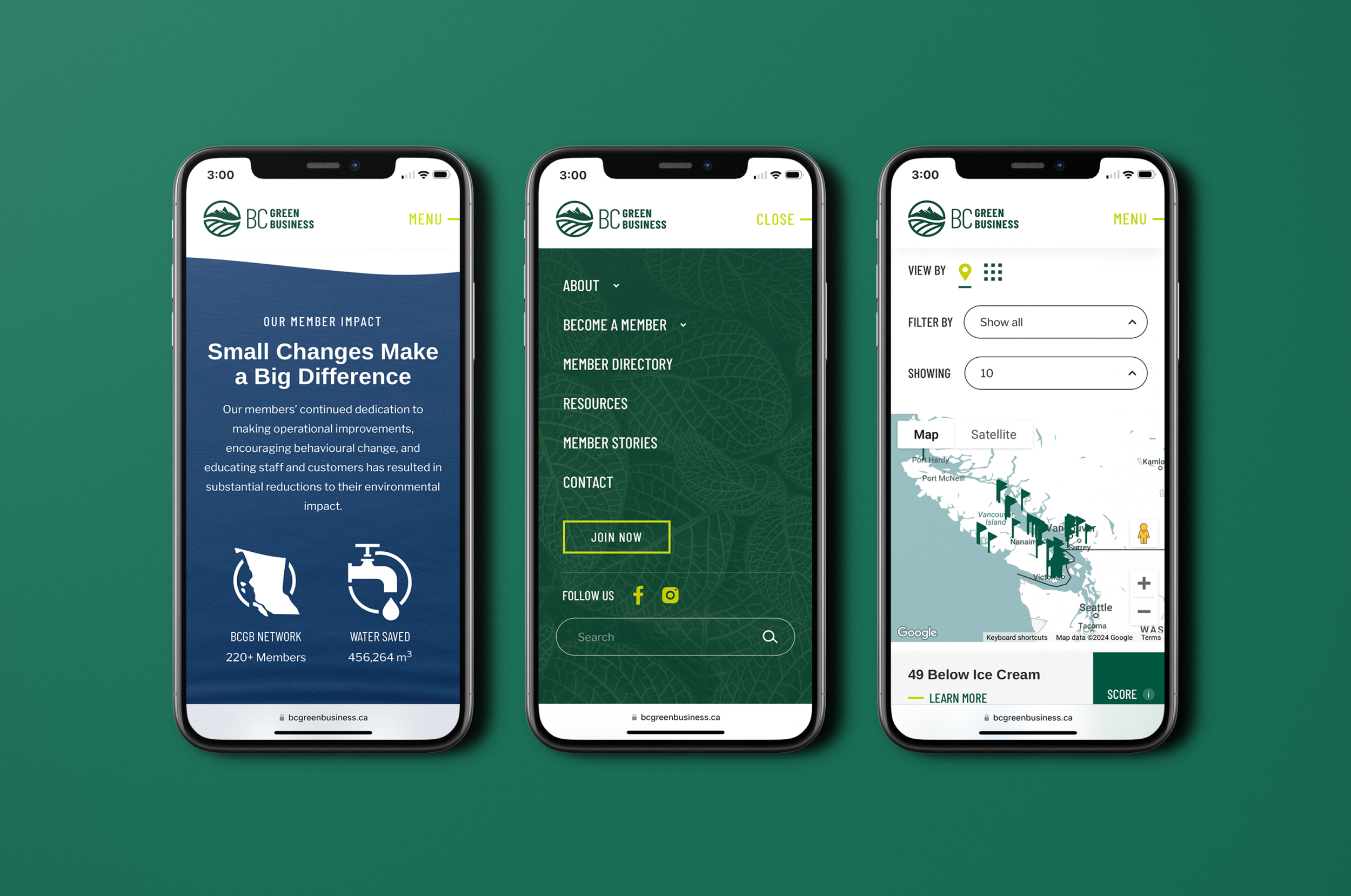
BC Green Business
BriefBC Green Business is a rebrand of the Vancouver Island Green Business Collective. The existing identity featured a circular mark with mountains and a leaf, but felt dated and in need of refinement.
The goal was to evolve the brand into a more modern, flexible system while maintaining a clear connection to its roots. The updated identity needed to feel fresh and vibrant, while still grounded in the organization’s environmental focus.
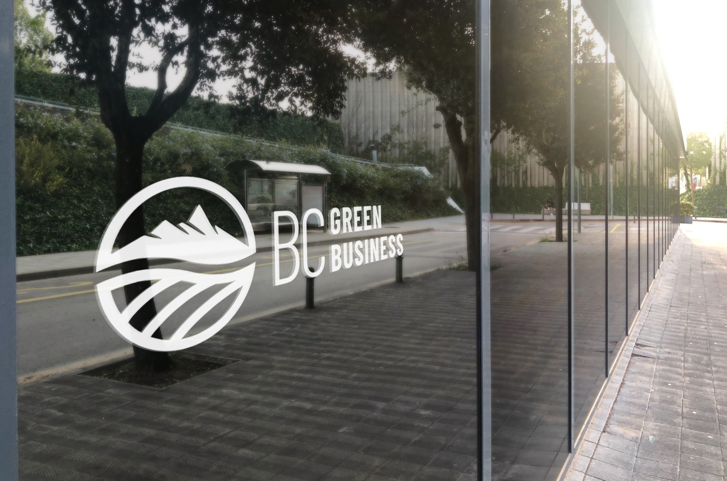
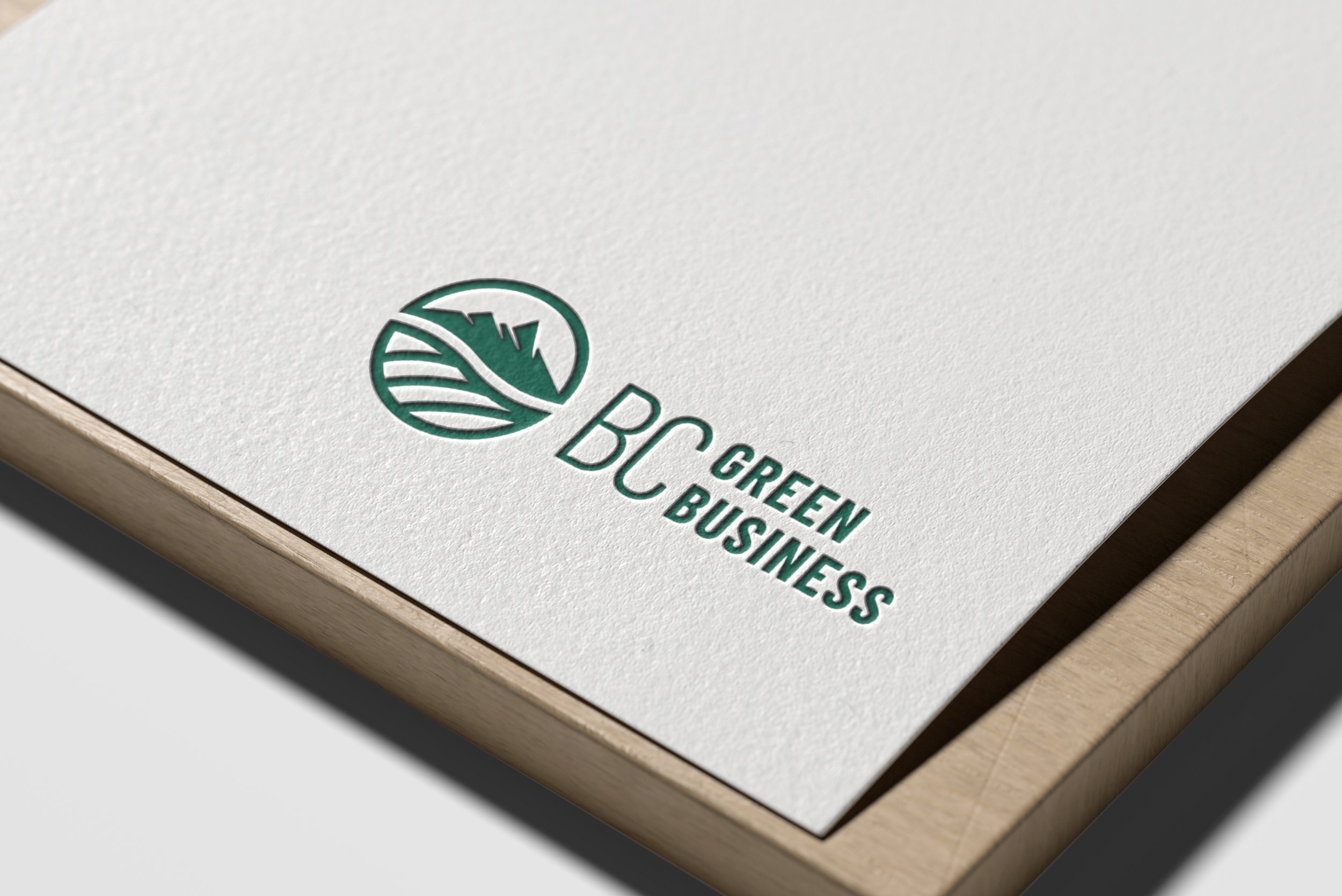
The ApproachThe identity builds on familiar elements from the original mark, reworking them into a simplified, contemporary form. At the center is an icon featuring British Columbia’s mountain ranges, symbolizing strength, resilience, and place.
Beneath the peaks, the forms can be read as either rolling landscape or the veins of a leaf, reinforcing the organization’s connection to both business and the natural environment.
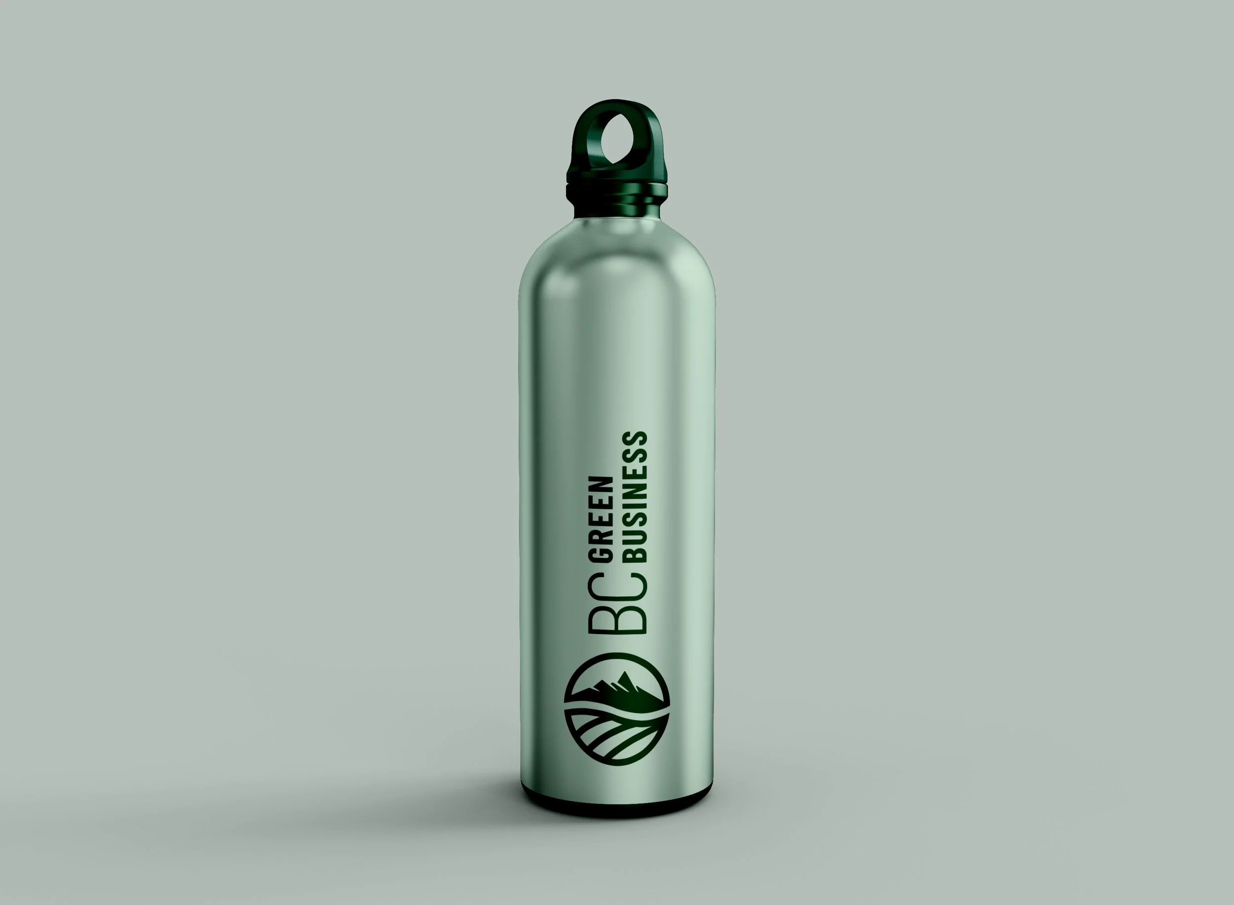
A refreshed colour palette introduces more vibrancy while retaining core blues and greens, striking a balance between energy and trust. The typography pairs thin and bold uppercase sans serif styles, creating contrast and clarity while emphasizing growth and forward movement.
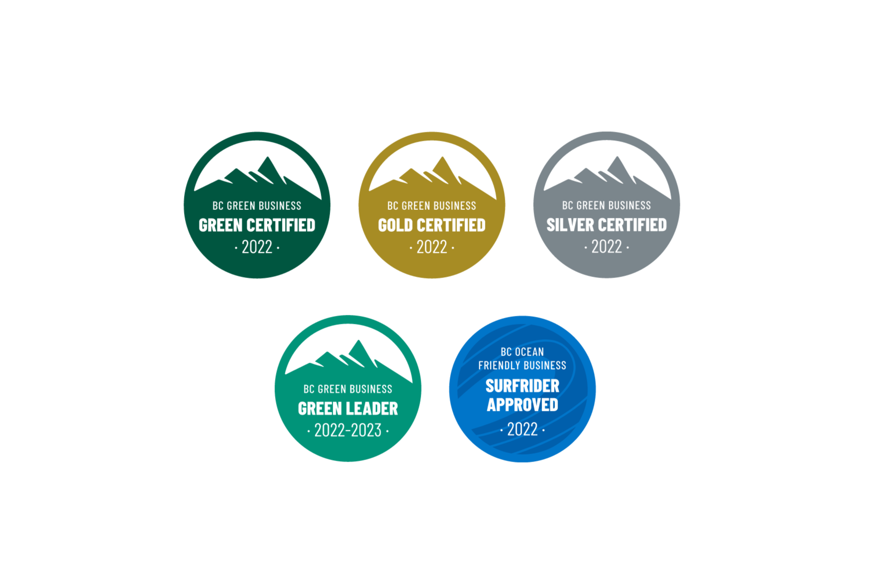
The resultThe updated identity balances familiarity and progress through a clean, modern visual system. The refined icon maintains a connection to the original brand while offering a more distinctive and adaptable mark.
The typography and colour palette bring a renewed sense of energy, allowing the brand to communicate clearly and consistently across applications while supporting its mission to promote sustainable business practices.
Work created as designer for Array Studios through a collaborative process.


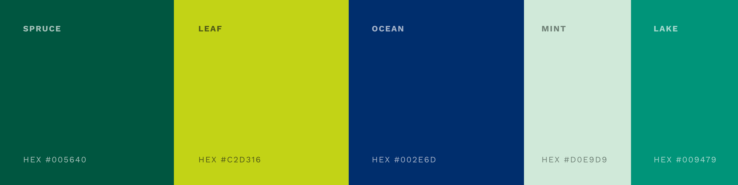
colour paletteThe vibrant color palette features fresh blues and greens, evoking a sense of vitality and connection to nature. To complement these lively hues, a subtle mint color provides a gentle balance, adding a softer touch to the overall design. This dynamic selection not only highlights the organization’s forward-thinking approach but also reflects the coastal beauty of Vancouver Island, grounding the brand in its natural surroundings. Together, these colors create an inviting and energetic aesthetic that resonates with the organization’s mission and values.