West Coast Gates
BriefWest Coast Gates is an established company that underwent a change in ownership and needed a refreshed visual identity to reflect its new direction. The existing brand felt dated and no longer resonated with its target audience. The goal was to reposition the company with a minimal, modern identity rooted in a distinct West Coast sensibility while clearly communicating the values of trust, quality, and craftsmanship.
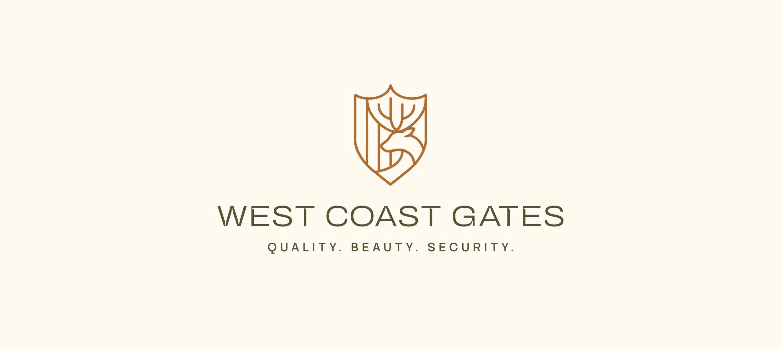
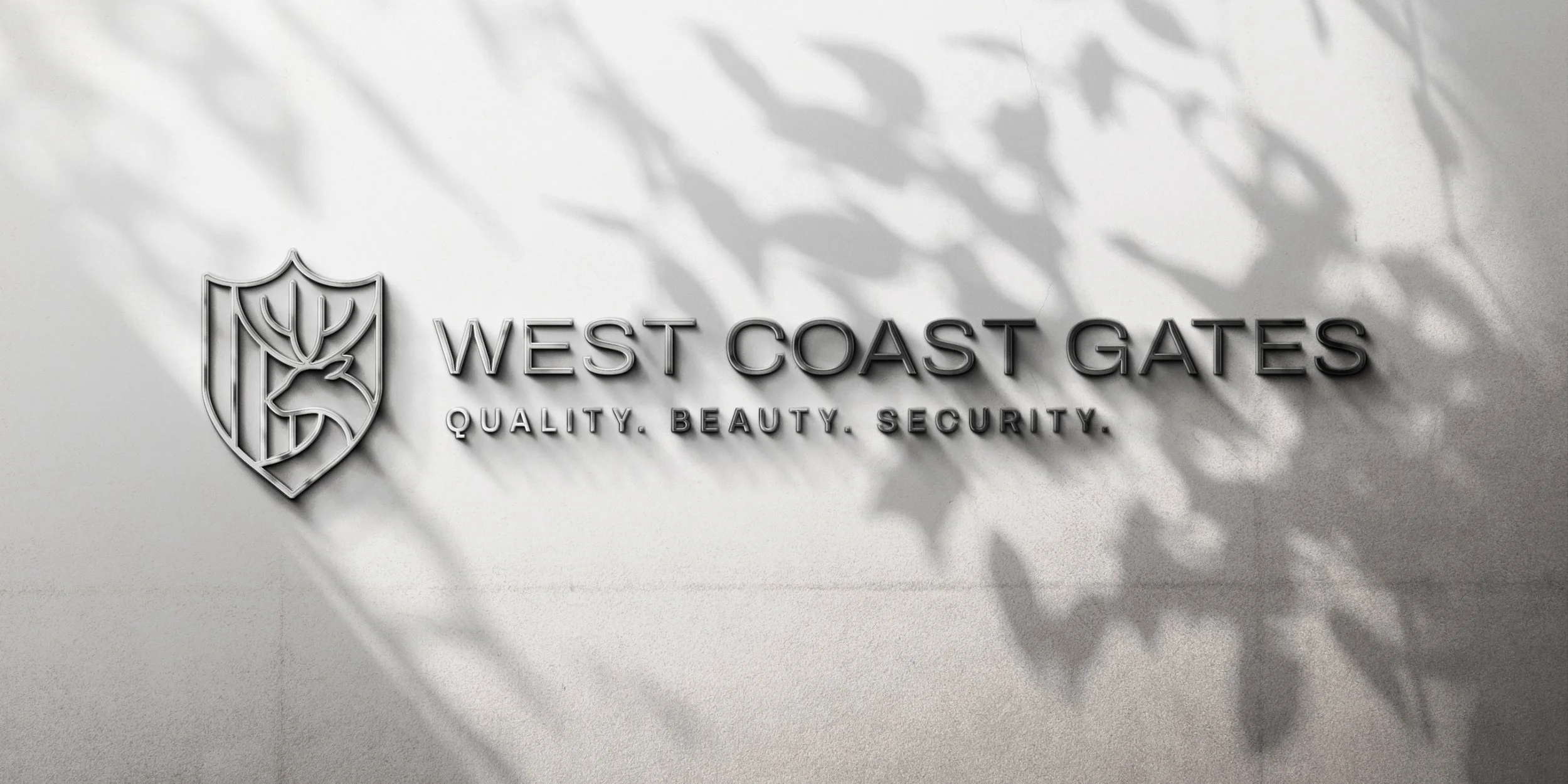
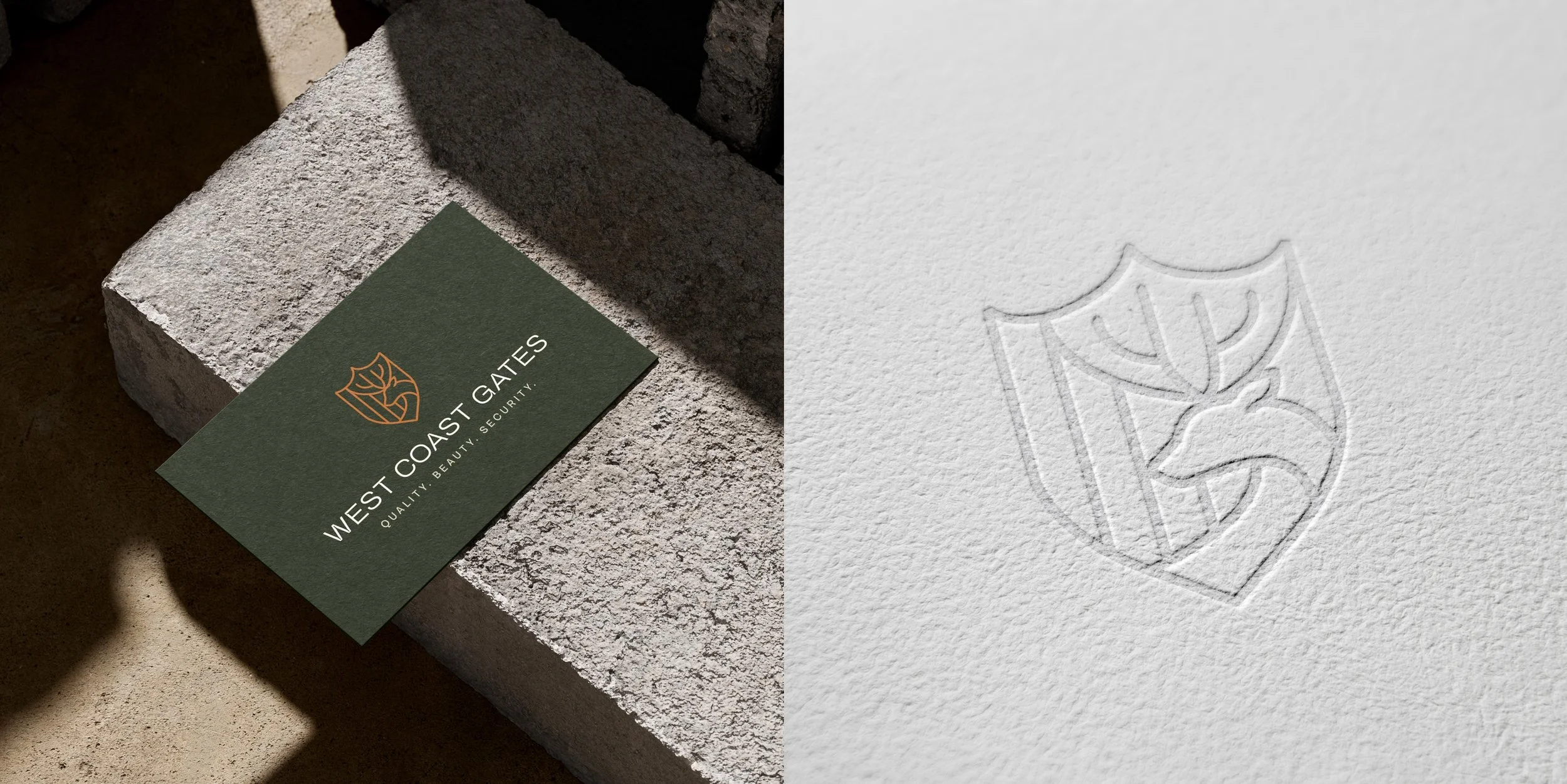
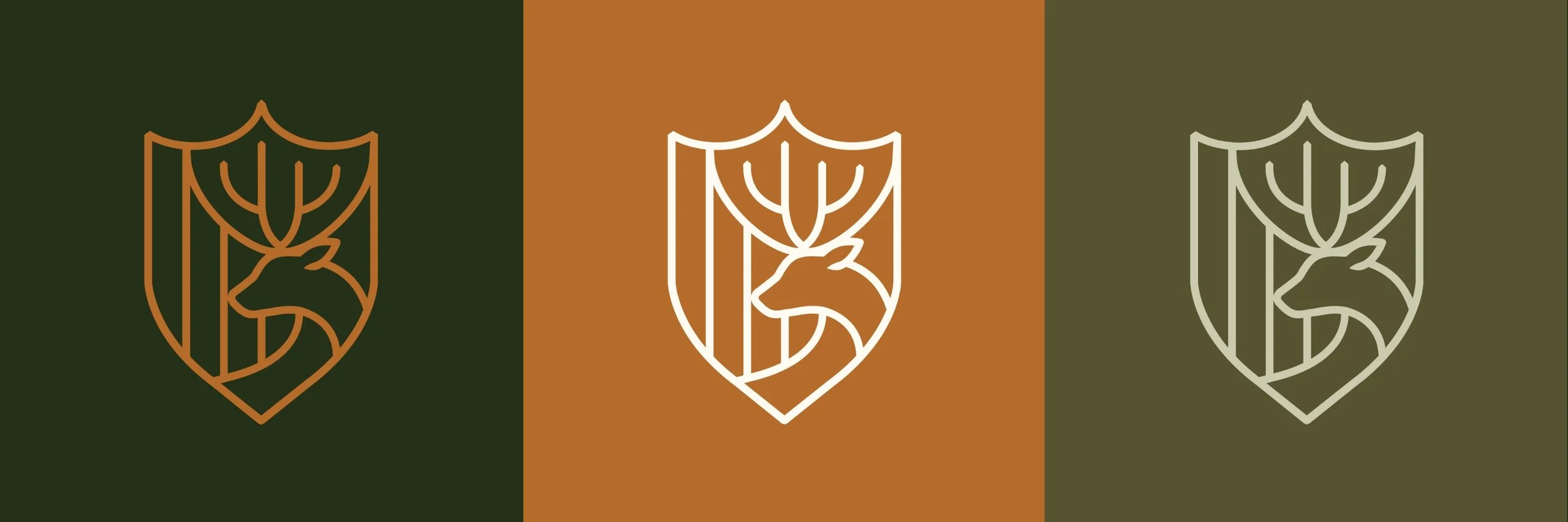
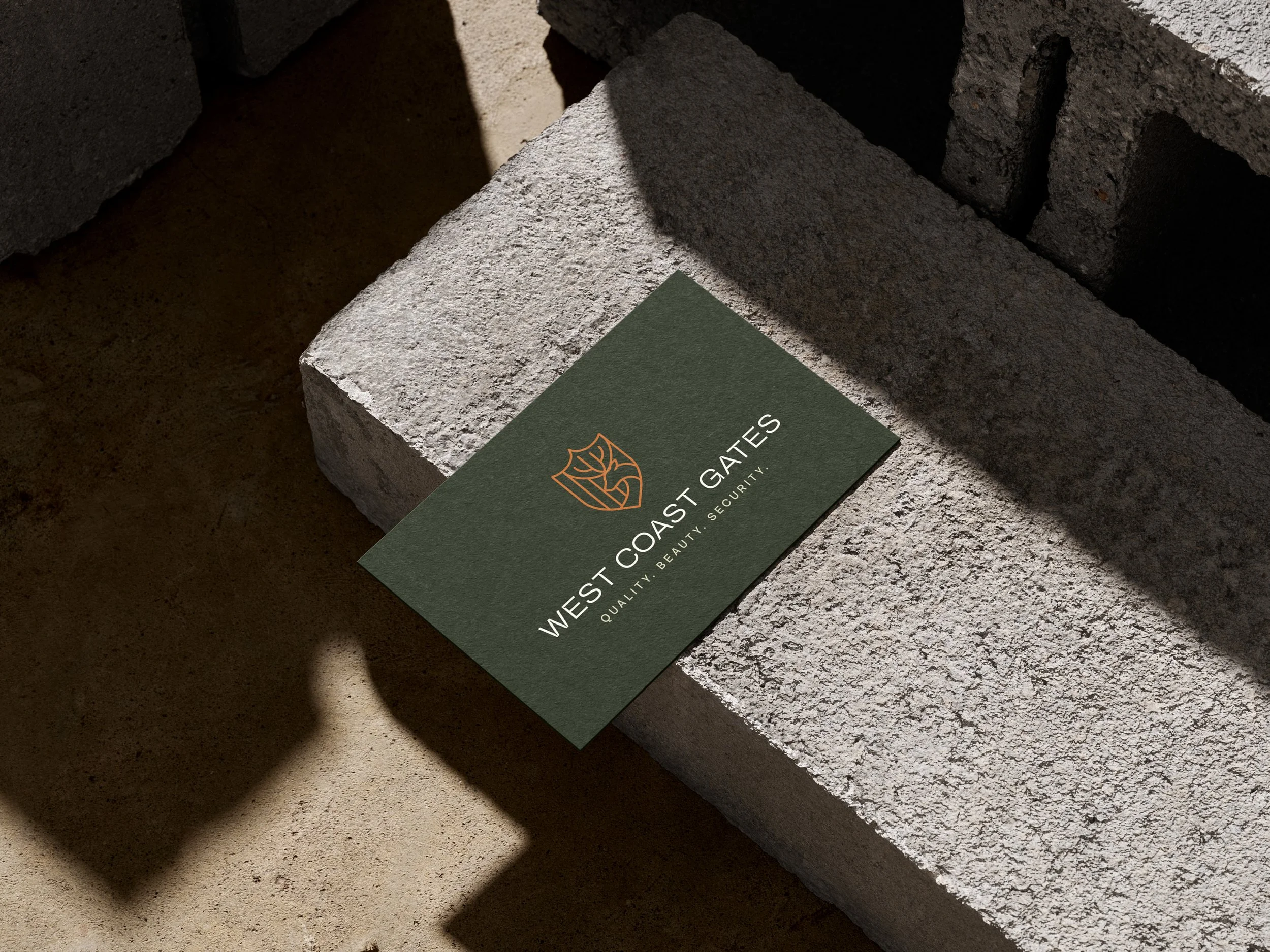
The approachThe identity was designed to capture the balance between strength and refinement that defines the company’s work. At the center of the system is a custom icon that weaves together three core brand ideas: quality, security, and beauty.
A crest-like shape introduces a sense of protection and reliability, reinforcing the brand’s role in safeguarding property. Vertical line elements reference gate and fence posts, emphasizing structure, precision, and craftsmanship.
To ground the brand in its regional identity, a deer motif was incorporated into the icon. Beyond its symbolism within the West Coast landscape, the deer also reflects the practical reality many property owners face — protecting land from wildlife while maintaining a connection to the natural environment.
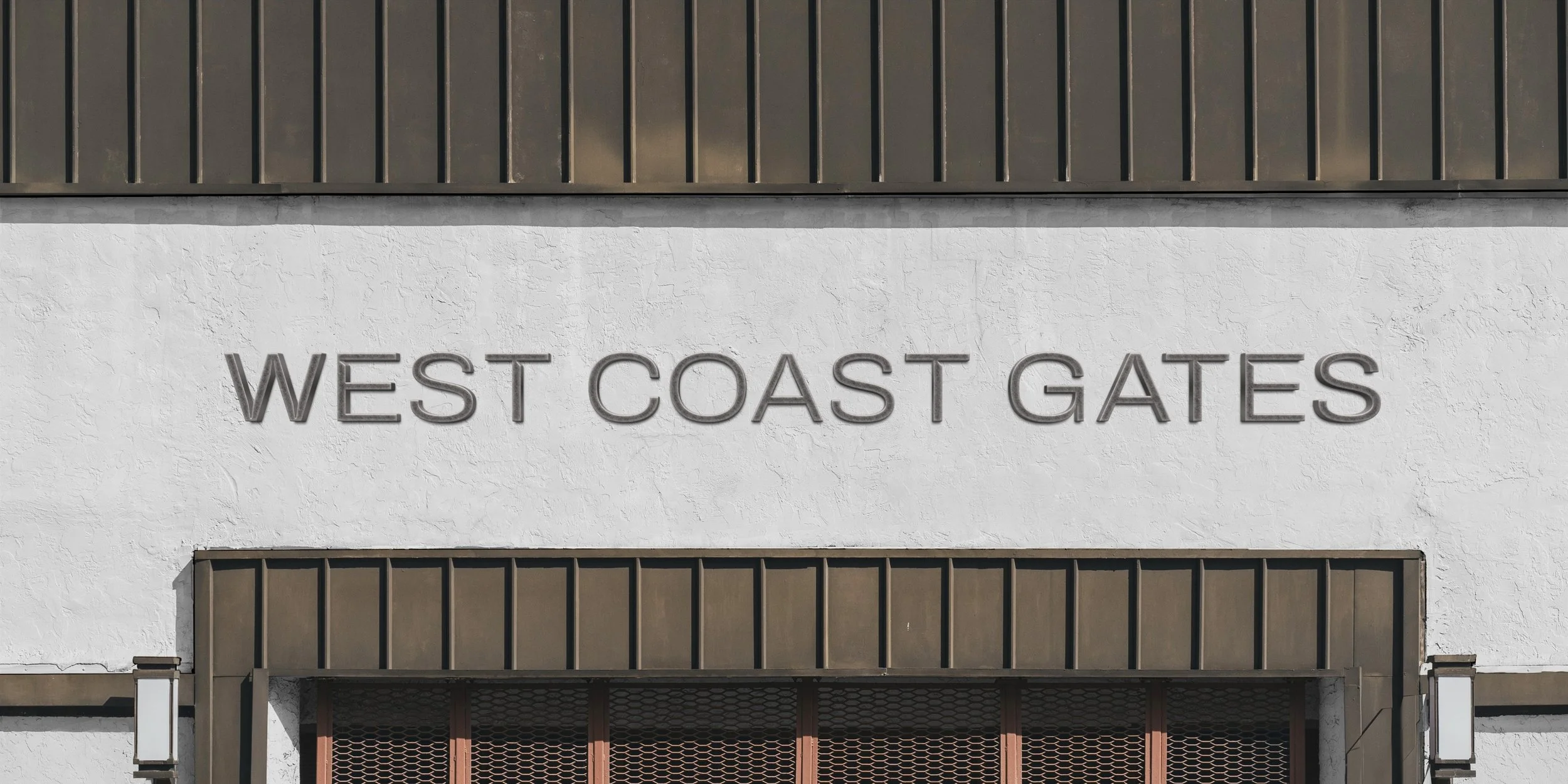
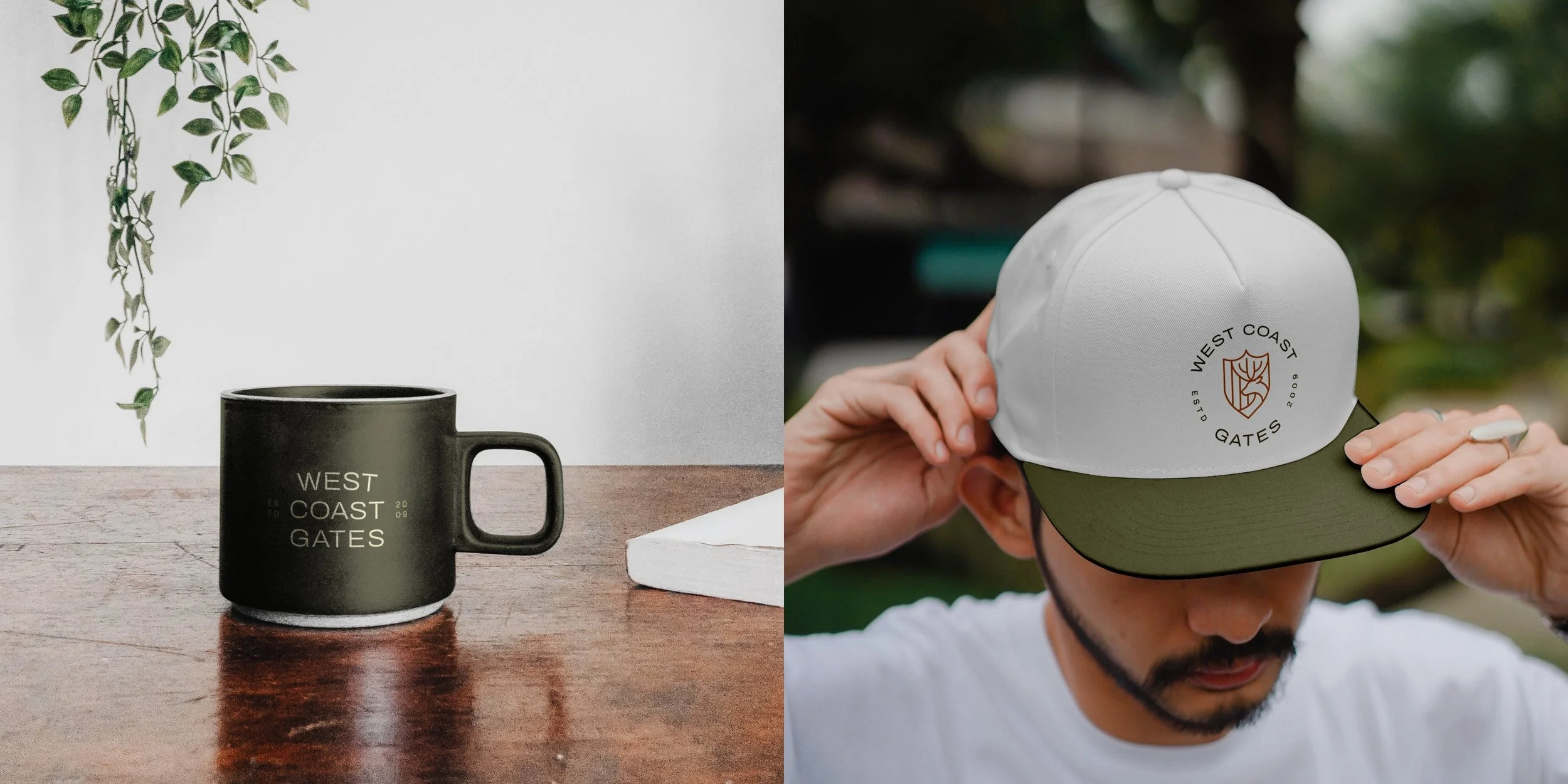
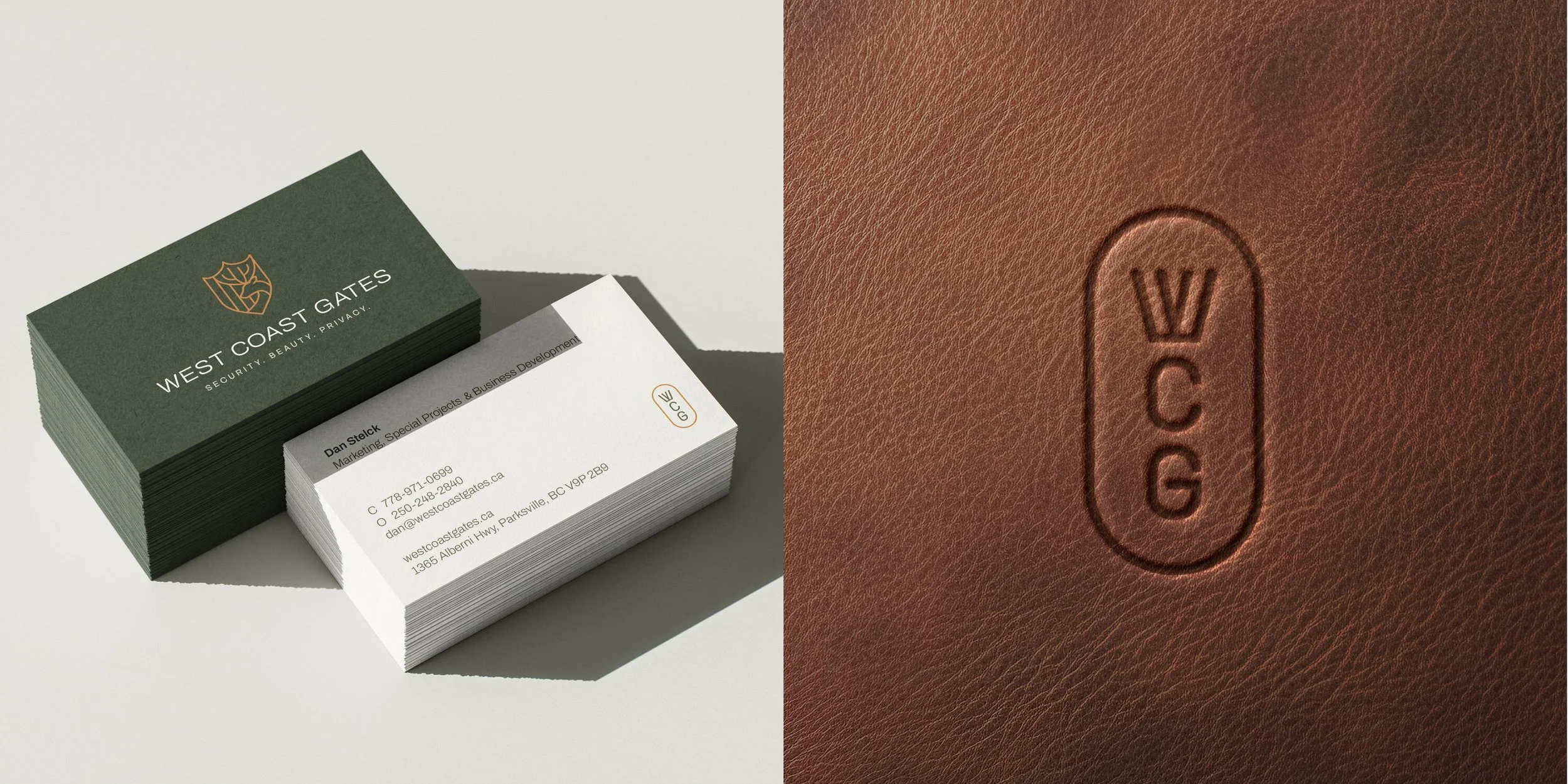
The resultThe refreshed identity balances restraint and character through a clean, modern visual system. The custom icon anchors the brand with a distinctive mark that communicates both reliability and place.
The typography features subtle, precise notches that introduce a slightly industrial tone while maintaining clarity and legibility. Supporting the primary mark, a suite of secondary logos and brand elements extends the identity into a flexible system that allows the brand to appear consistently and confidently across a range of applications.