Nordiq Canada
Brief
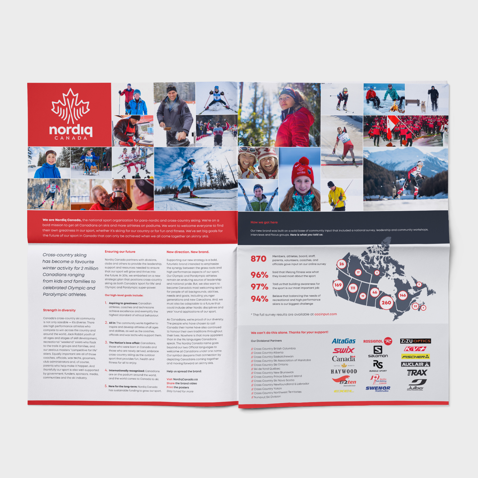
Nordiq Canada is the national governing body for cross-country skiing in Canada, formerly known as Cross Country Ski de Fond Canada. Following a rebrand and name change, the organization needed a new visual identity that reflected both its Canadian roots and the strong sense of community that defines the sport. The identity needed to feel distinctly Canadian while capturing the movement, energy, and shared spirit of cross-country skiing across the country.
The Approach
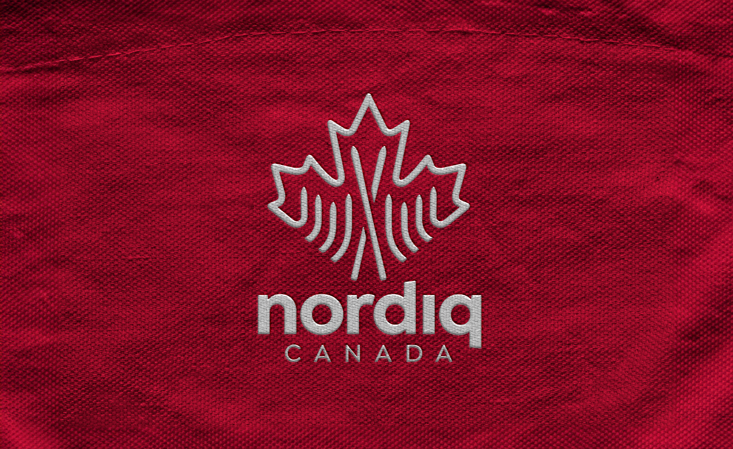
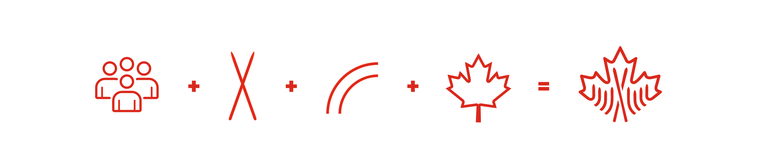
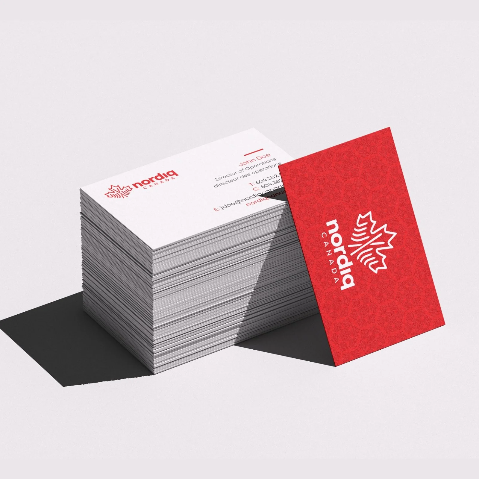
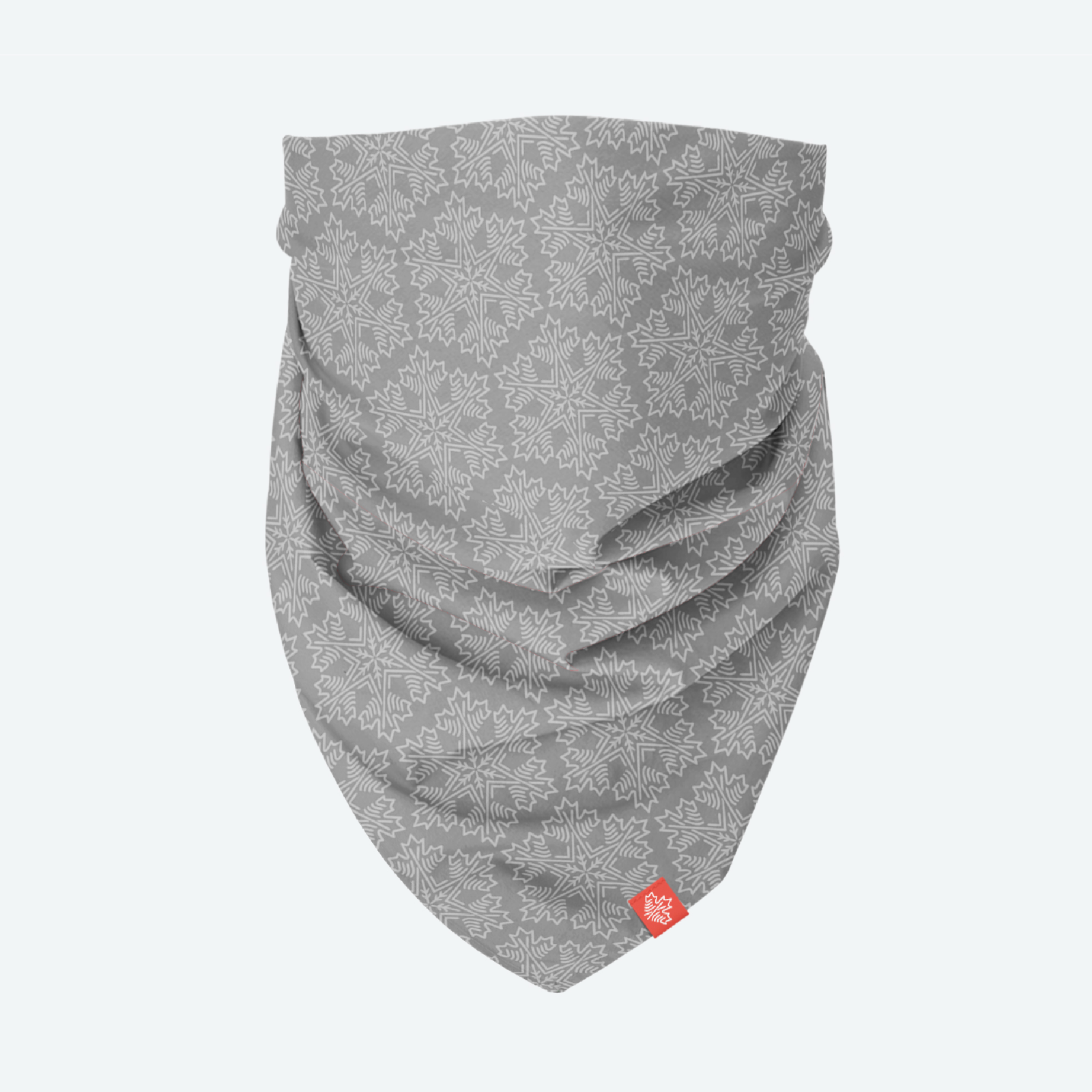
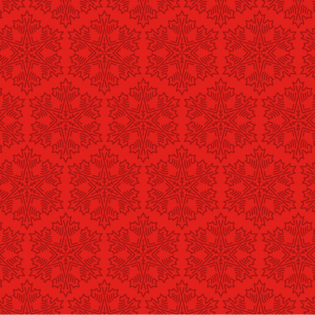
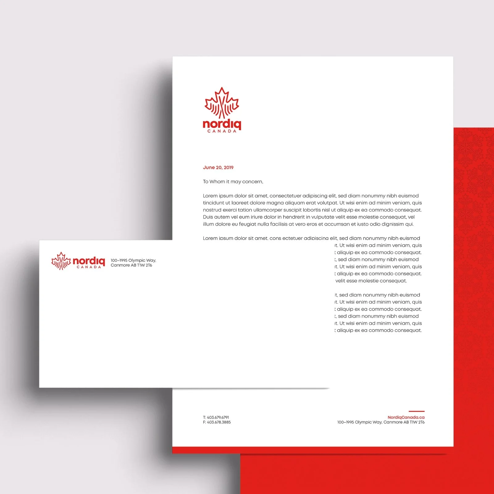
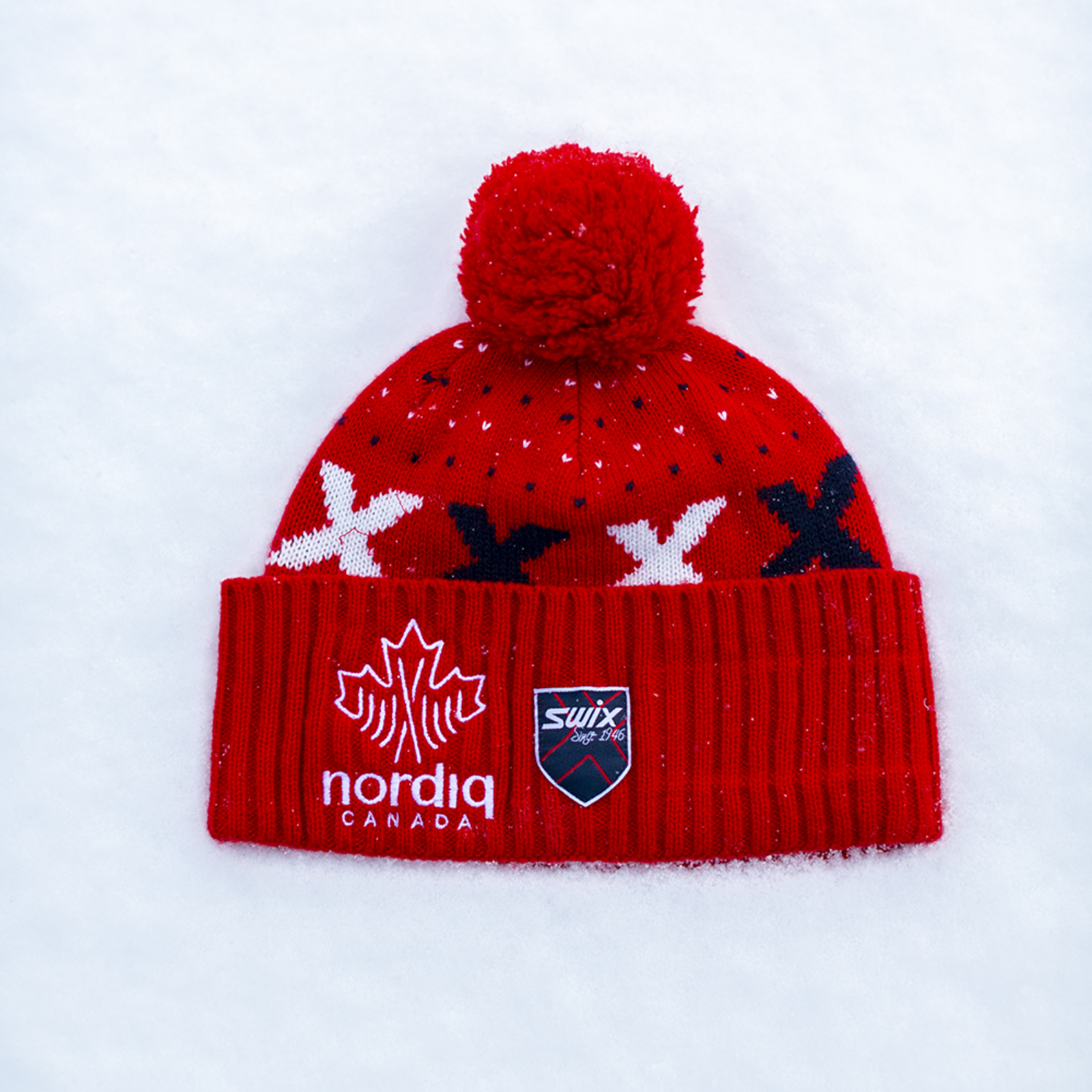
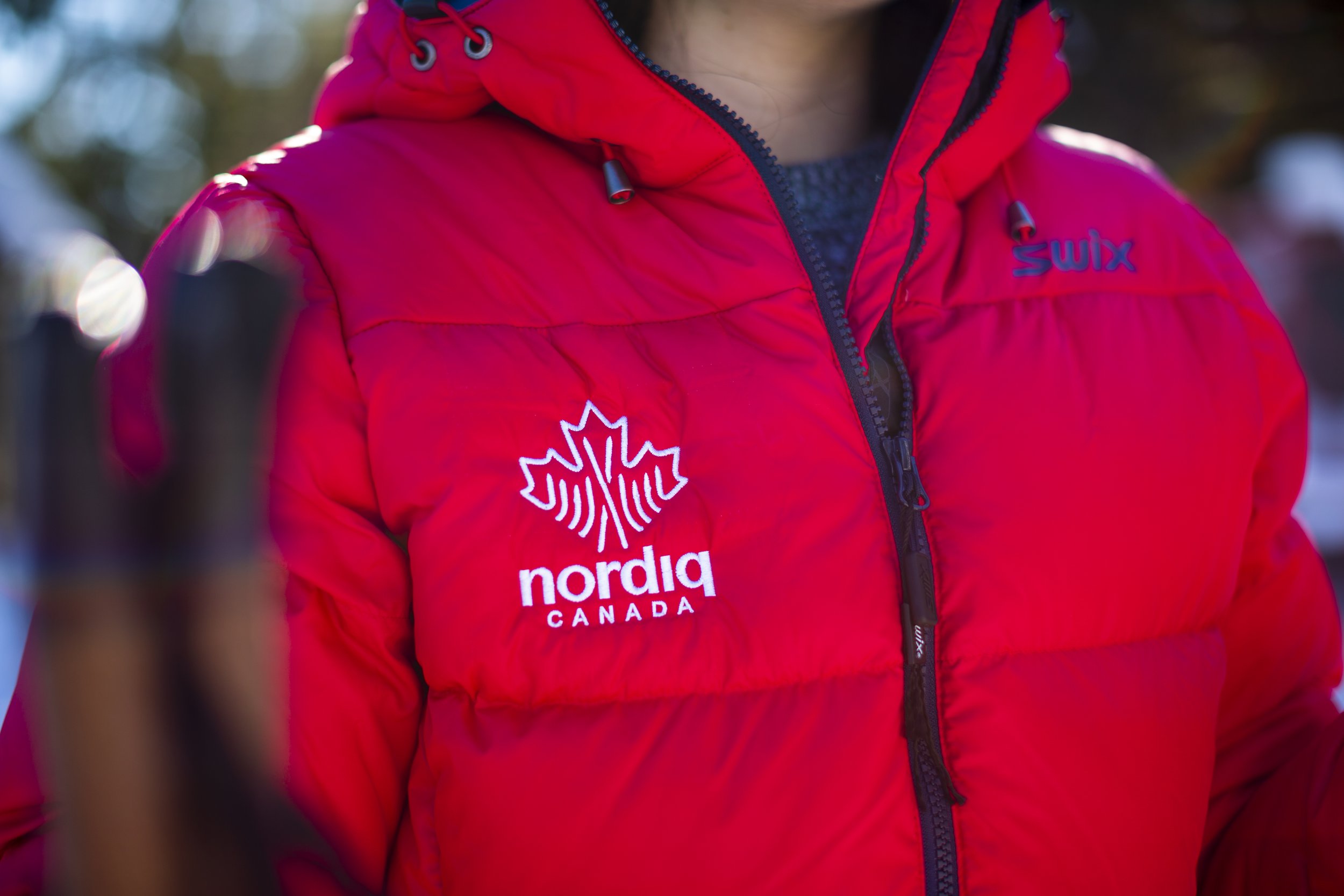
At the center of the identity is a custom maple leaf icon that serves as a symbol of national pride and connection to the Canadian landscape. Within the leaf, cross-country skis form the central spine of the mark, directly referencing the sport while reinforcing the structure of the symbol itself.
Radiating from this central element are ski paths that branch outward across the leaf. These lines represent the many athletes, clubs, and communities that make up the Nordic skiing network across Canada, highlighting the interconnected nature of the sport and the strength of its community.
The upward orientation of the skis introduces a sense of motion and momentum, reflecting both the physical movement of the sport and the organization’s forward-looking vision for its future.
The result
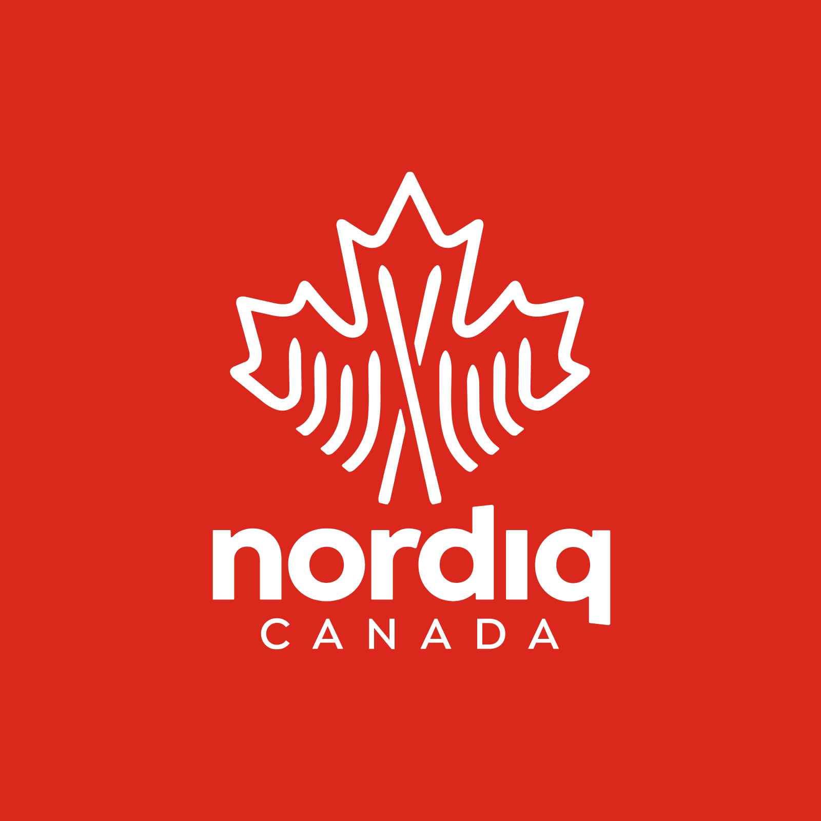
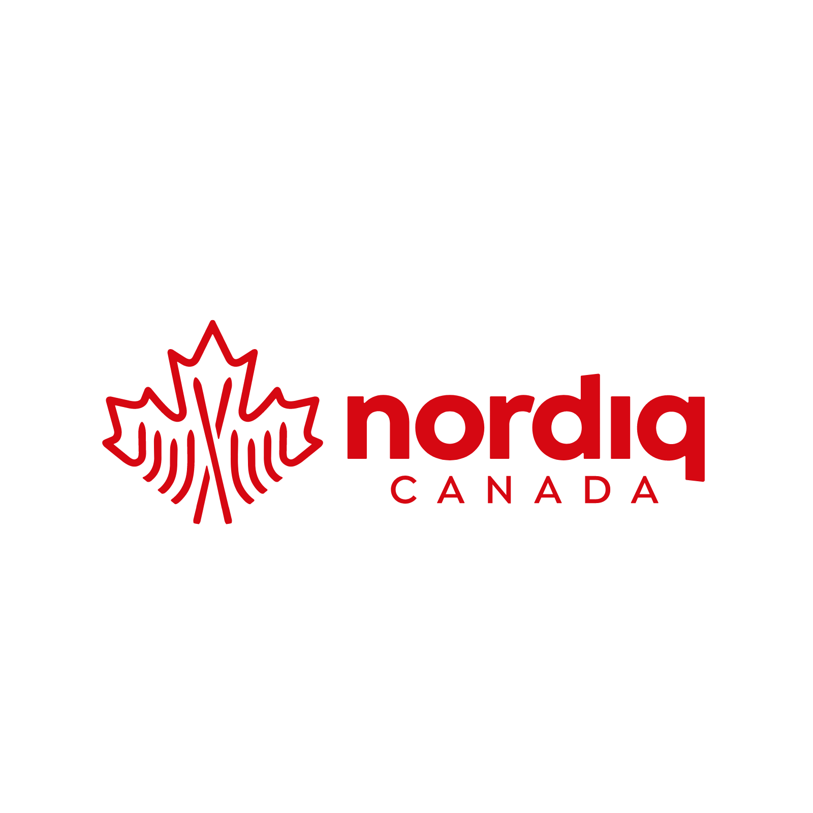
The final identity combines national symbolism with a dynamic representation of the sport. The custom maple leaf icon anchors the brand with a recognizable Canadian symbol, while the integrated ski elements bring energy and meaning to the design.
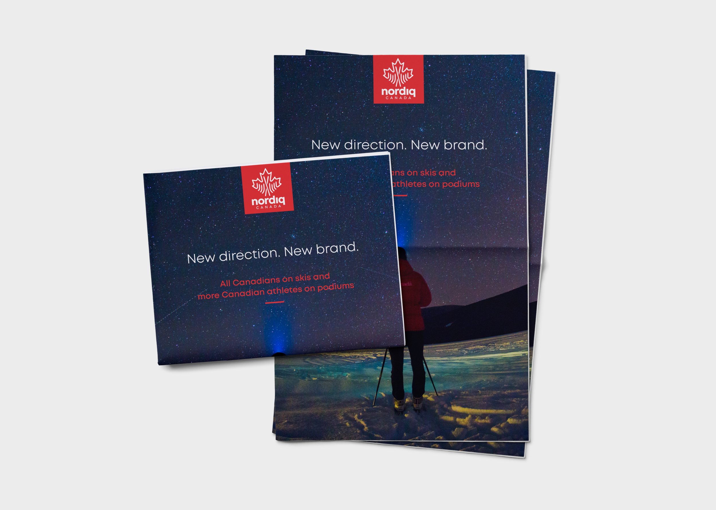
Together, these elements create a distinctive and memorable identity that celebrates both the athletic spirit of cross-country skiing and the strong community that supports it across Canada.
Work created as designer for Taiji Brand Group through a collaborative process.