Island Roots Group
BriefIsland Roots Group is a team of real estate professionals based in Nanaimo, helping clients find home on Vancouver Island. The goal was to develop a brand identity that felt strongly connected to place while reflecting the team’s values of transparency, strong communication, and putting their clients’ best interests first. The identity needed to balance professionalism with warmth, creating a brand that felt trustworthy, approachable, and rooted in the coastal community they serve.
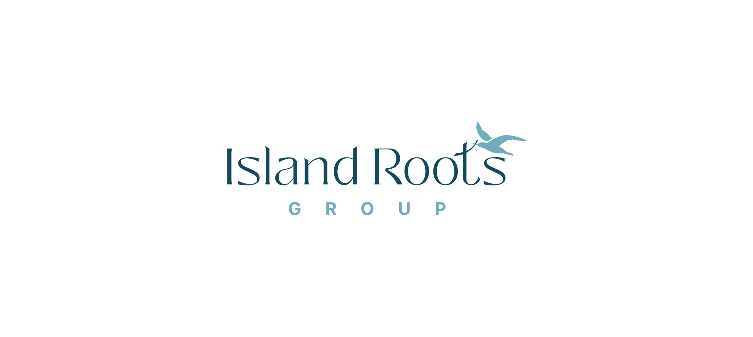
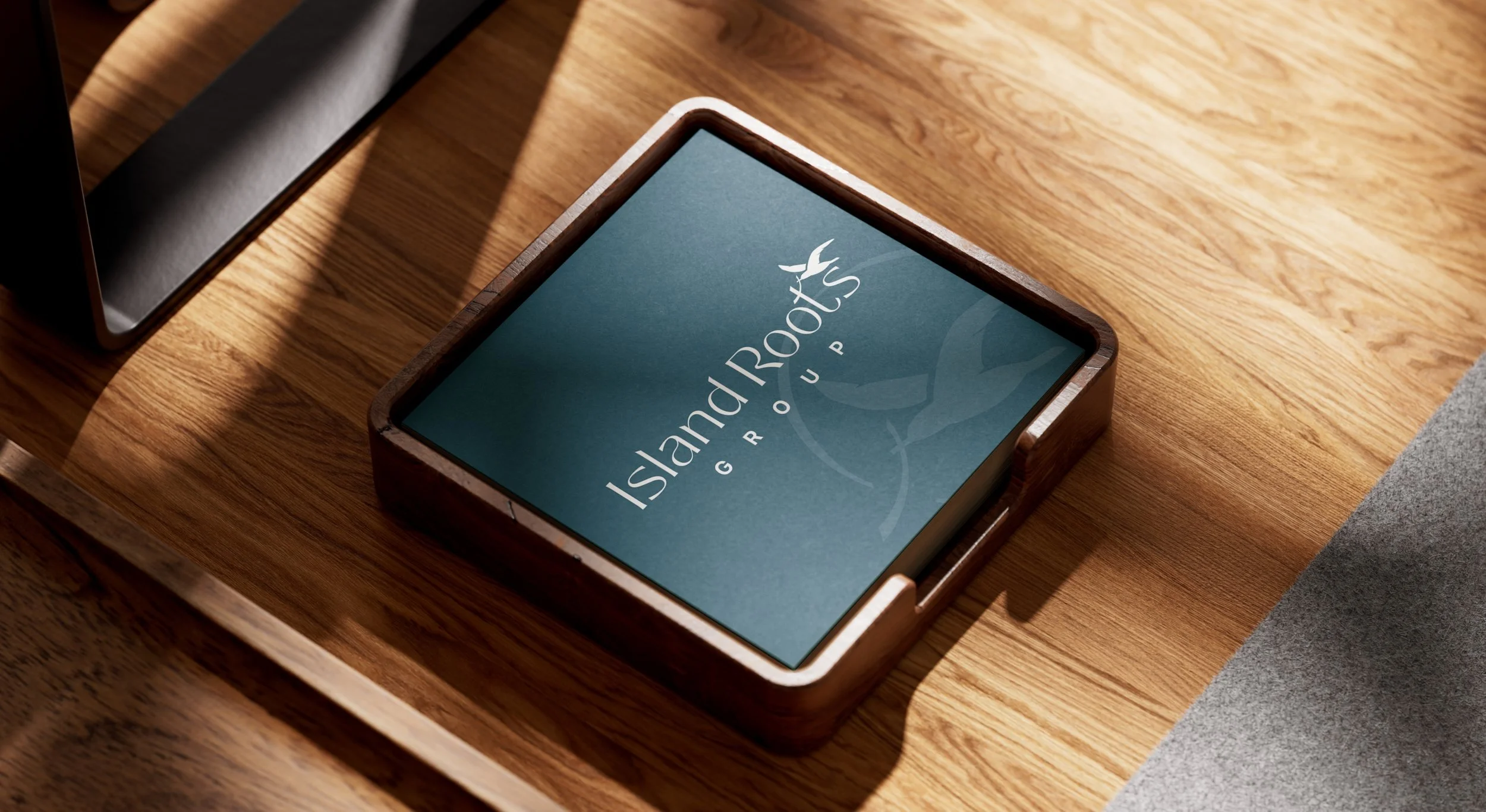
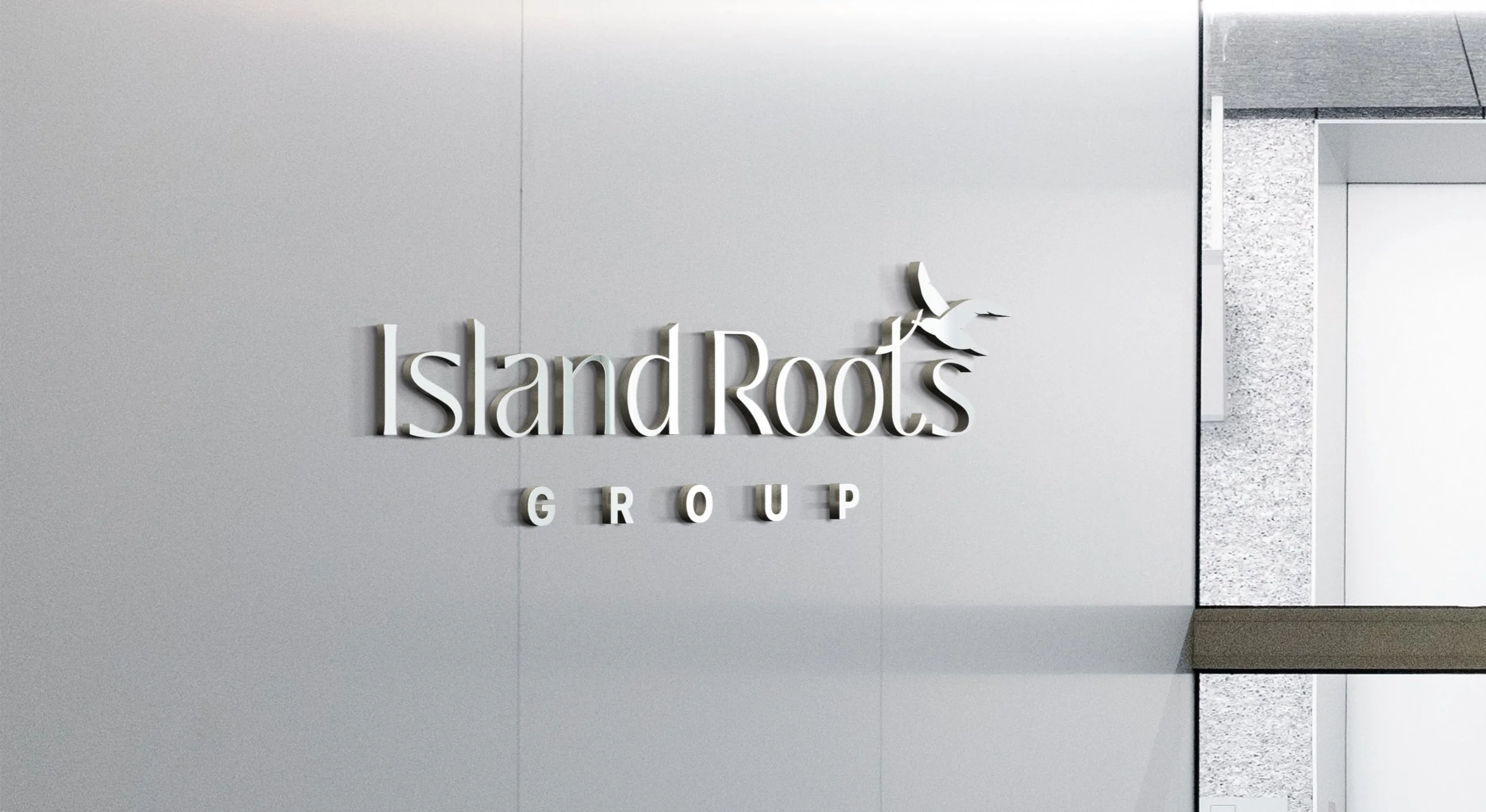
The approachThe identity centers on a custom illustrated icon inspired by the natural landscape of Vancouver Island. A coastal bird carrying a branch forms the horizontal cross of the letter “t,” subtly referencing the act of building a nest and the idea of creating a home.
This symbolism reflects the role Island Roots Group plays in guiding clients through the process of finding and establishing a place to belong. The organic imagery helps ground the brand in its local environment while reinforcing the themes of care, stability, and new beginnings.
The resultThe final identity captures a distinctly coastal character while maintaining a polished and professional tone. Subtly flared letterforms introduce a balance between classic and contemporary styling, while the illustrated icon provides a memorable visual anchor for the brand.
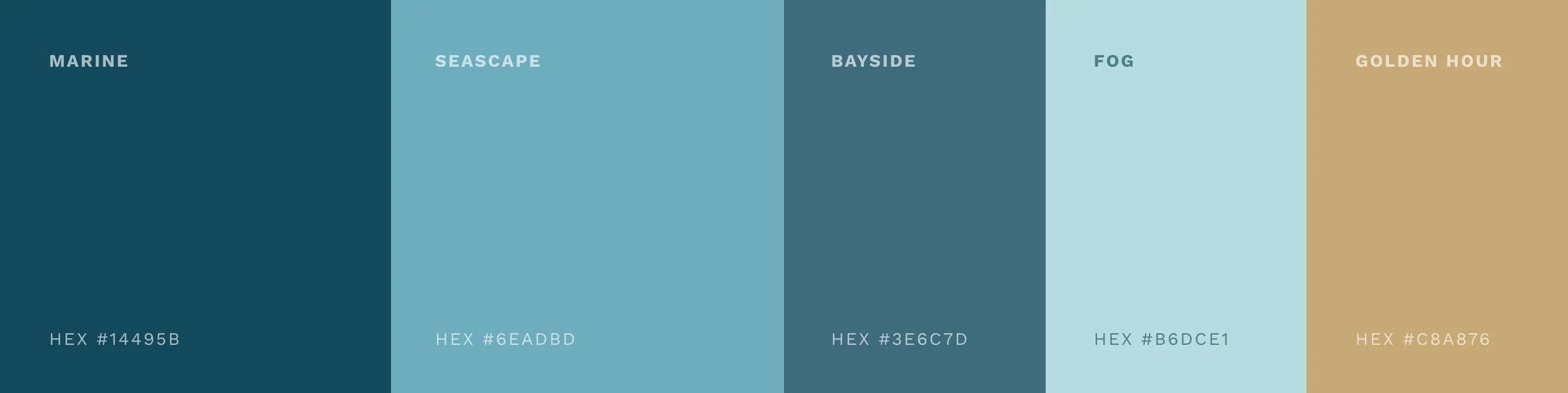
A colour palette inspired by beach glass — soft blues and teals — evokes the ocean landscape of Vancouver Island, while a touch of gold introduces a sense of quiet refinement. Together, these elements create a brand identity that feels both welcoming and credible, reflecting Island Roots Group’s commitment to thoughtful service and strong community connection.
Work created as designer for Array Studios through a collaborative process.