Gilbertson Group
BriefDevelop a new visual identity for Gilbertson Group, creating a distinctive brand presence for the commercial development space. The goal was to establish a strong, contemporary identity that communicates the group's character while creating a visual connection to the updated Gilbertson Fine Homes brand. The identity needed to establish its own personality while providing a cohesive foundation for the broader Gilbertson brand family.
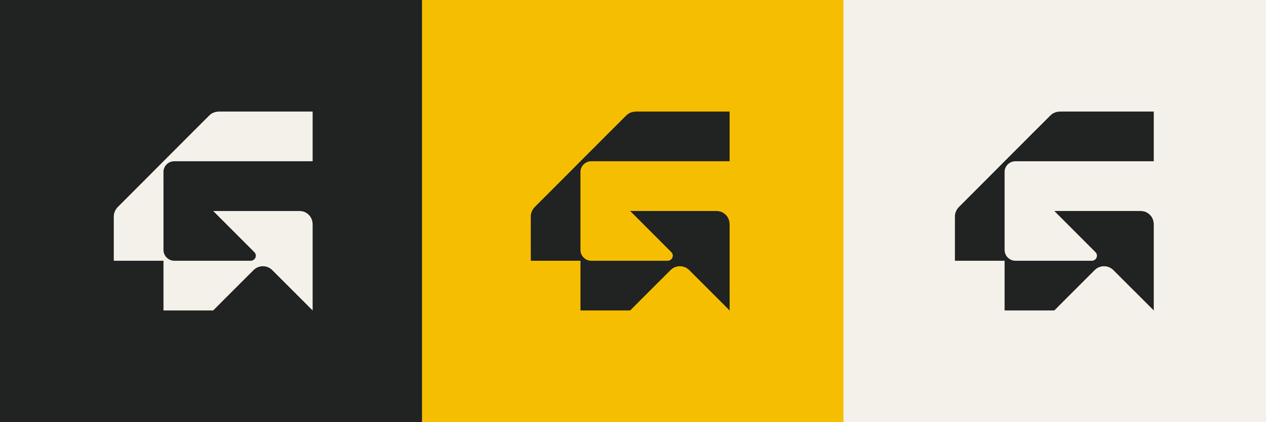
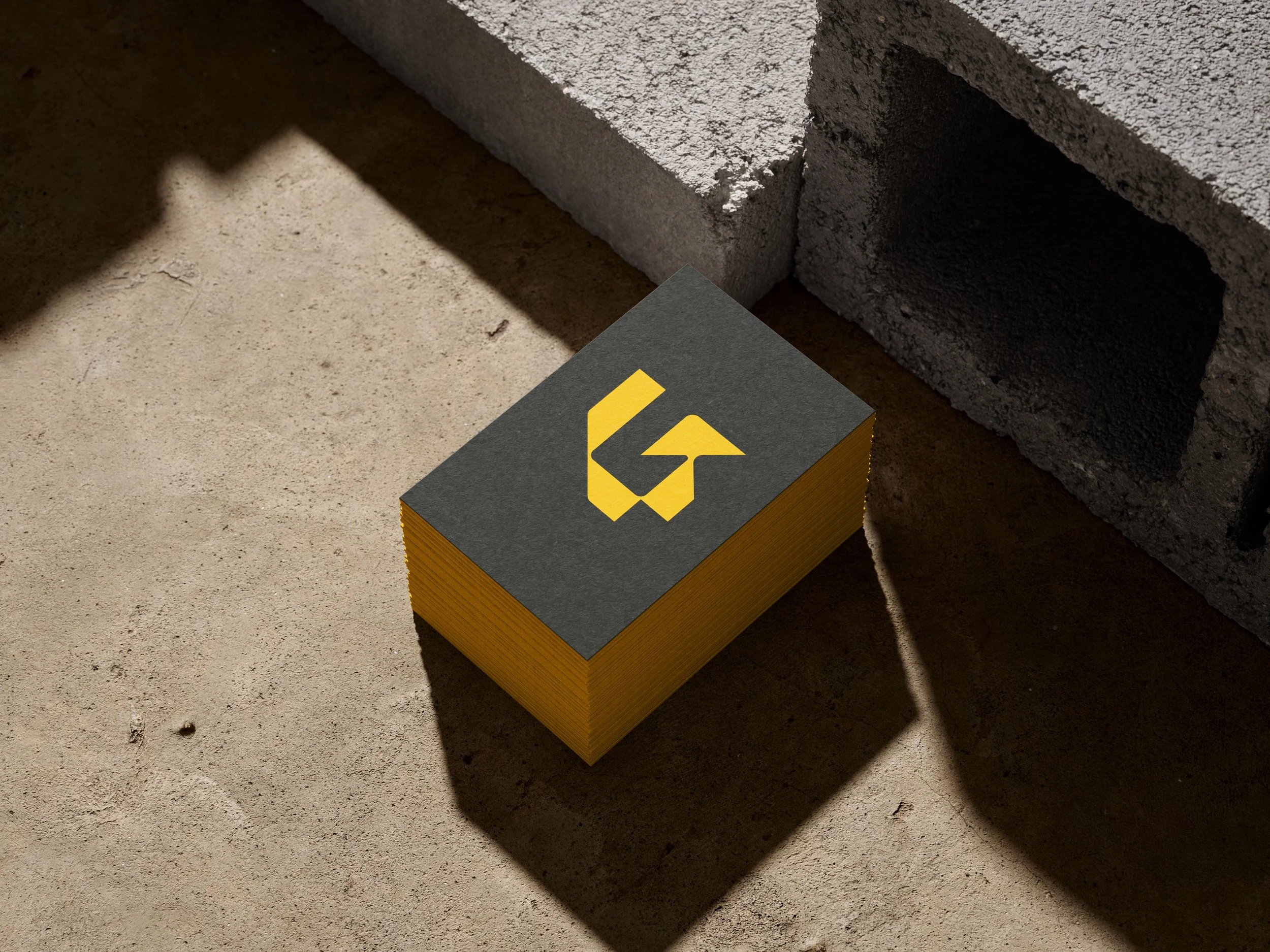
The approachThe identity centres around a custom geometric “G” symbol designed to communicate strength, precision and forward momentum. Its angular forms balance sharp, defined edges with subtle curves, creating a distinctive mark with an architectural, industrial quality that reflects the group's connection to the built environment.
The open, arrow-like ending introduces a sense of movement and progression, representing Gilbertson Group's forward-looking approach and ambition for continued growth.
A considered visual language was developed to complement the mark, bringing together confident typography, a distinctive colour palette and a flexible collection of logo configurations. Shared visual elements with Gilbertson Fine Homes establish a connection between the two brands while allowing each to maintain its own distinct character.
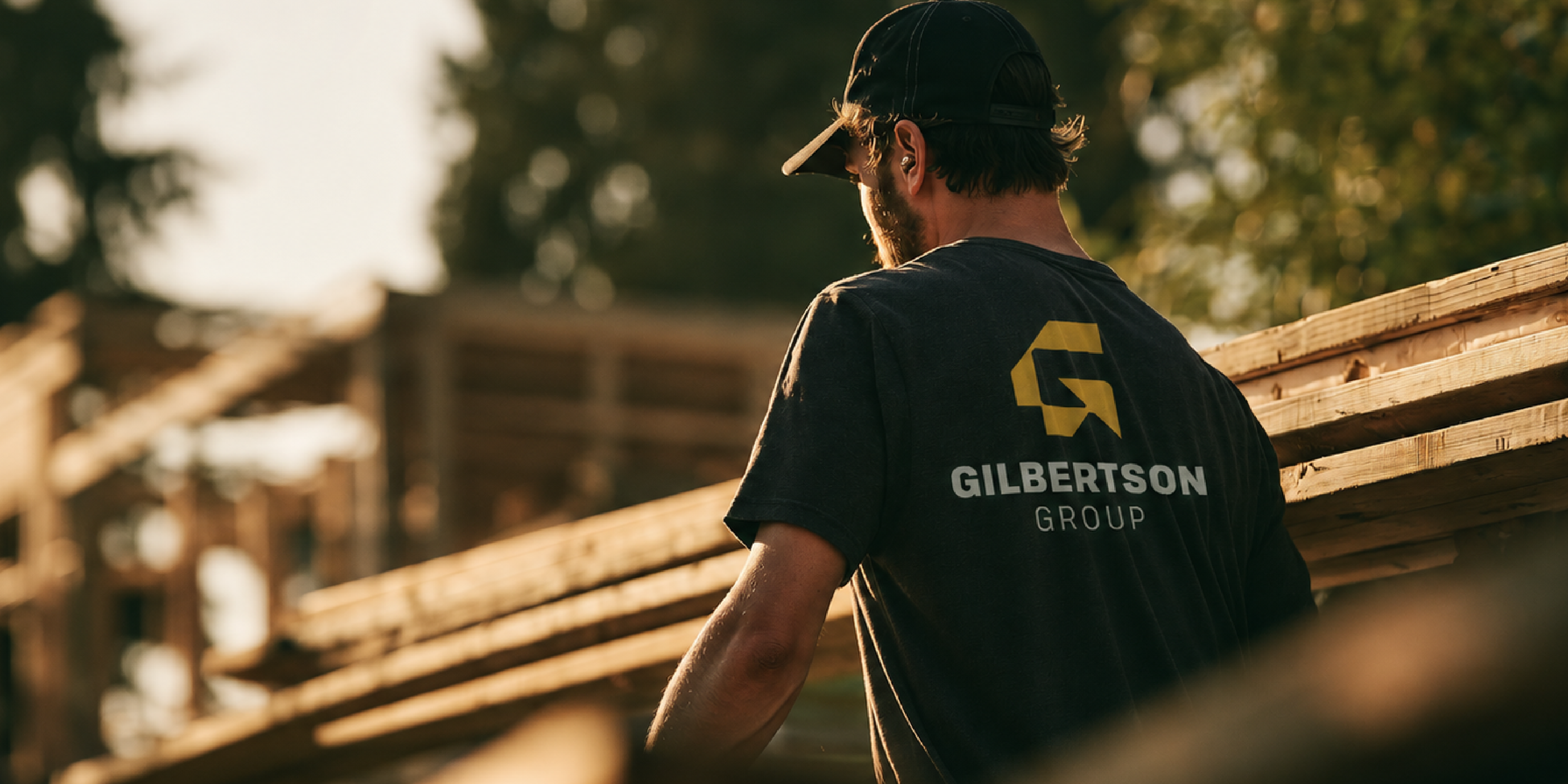
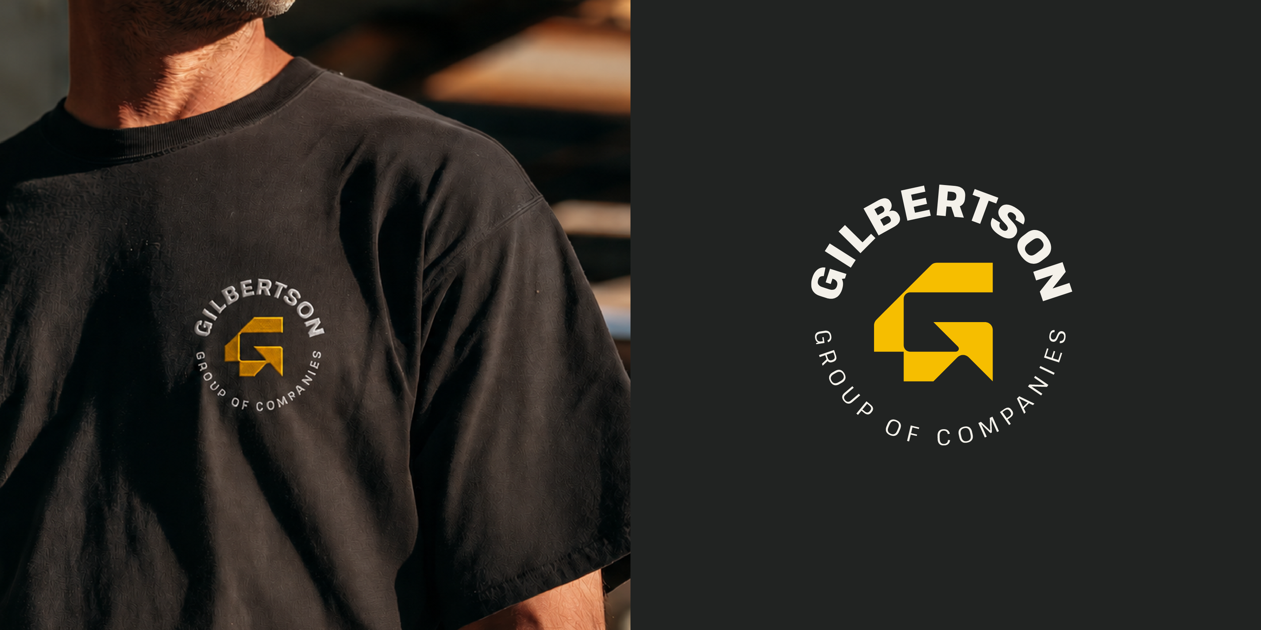
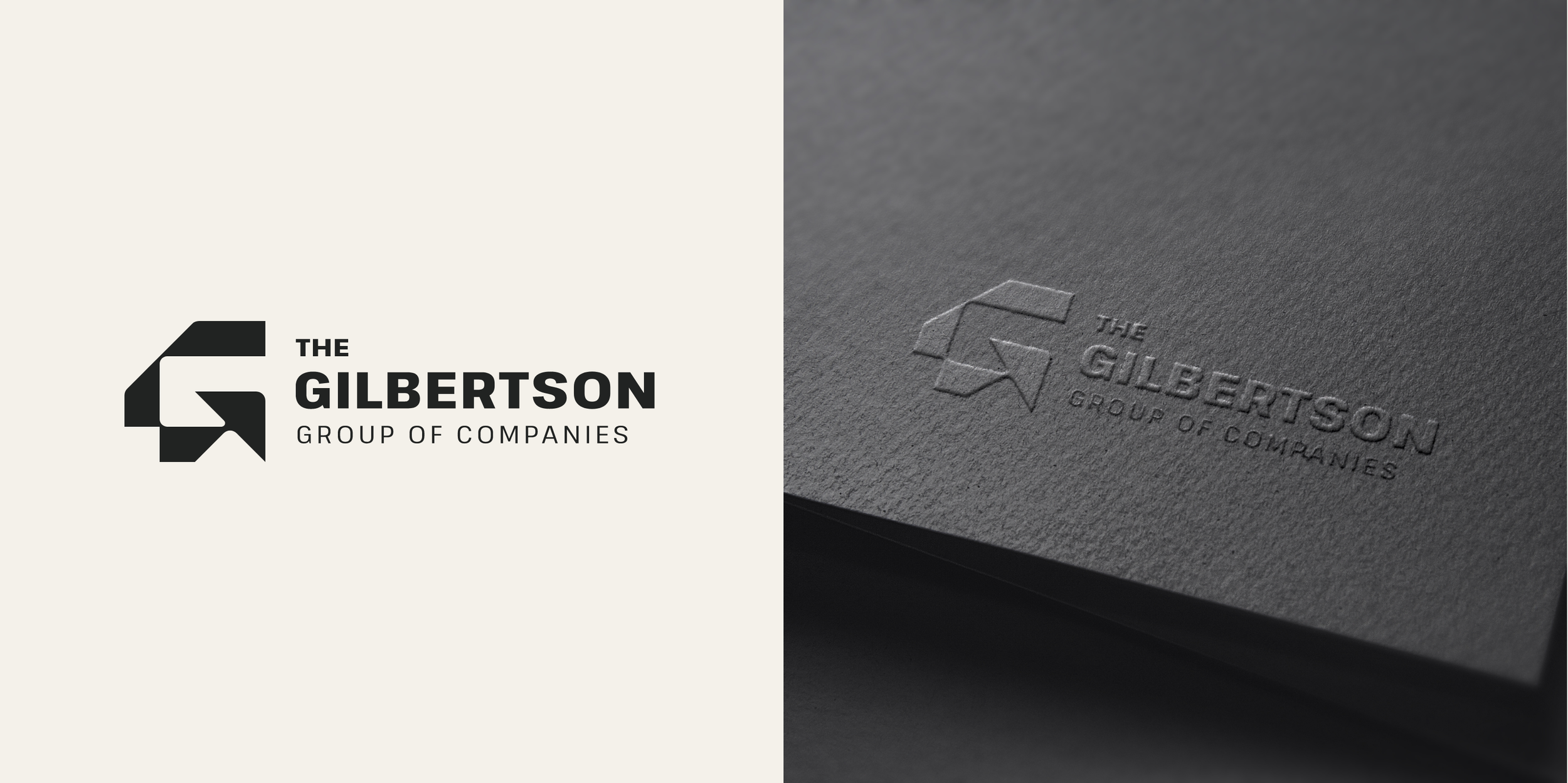
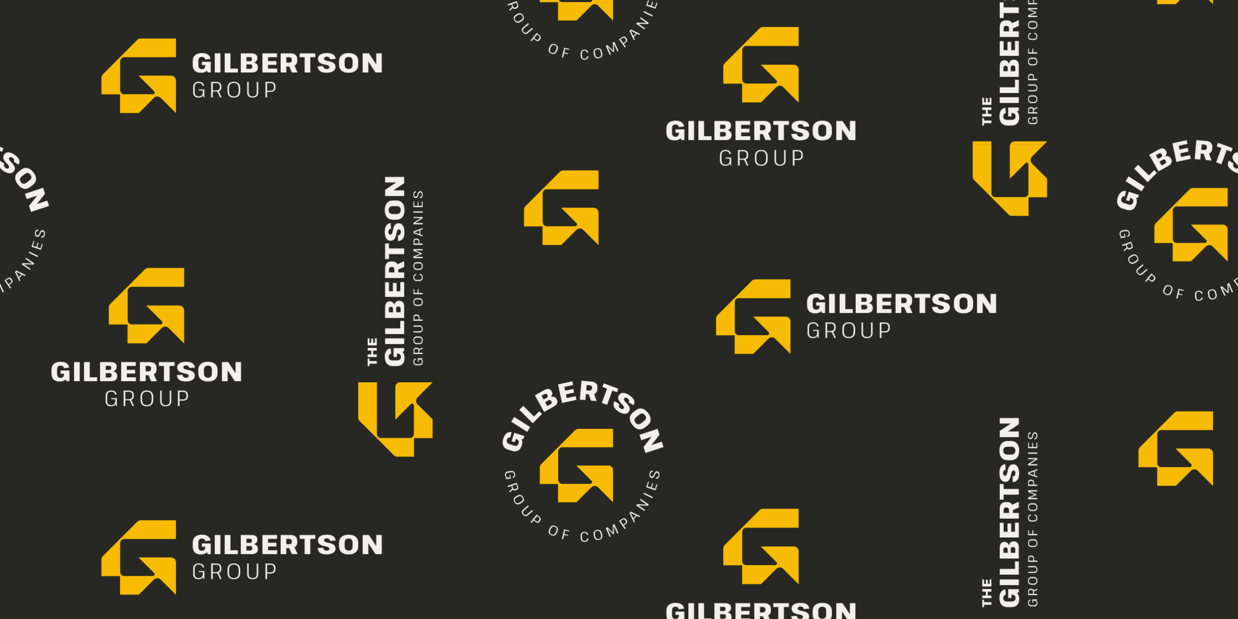
The resultThe resulting identity is a cohesive and adaptable visual system built around a recognizable primary logo, with horizontal and vertical configurations, a circular secondary logo and a standalone brand mark. Together, these provide flexibility across a range of applications while maintaining a consistent brand presence.
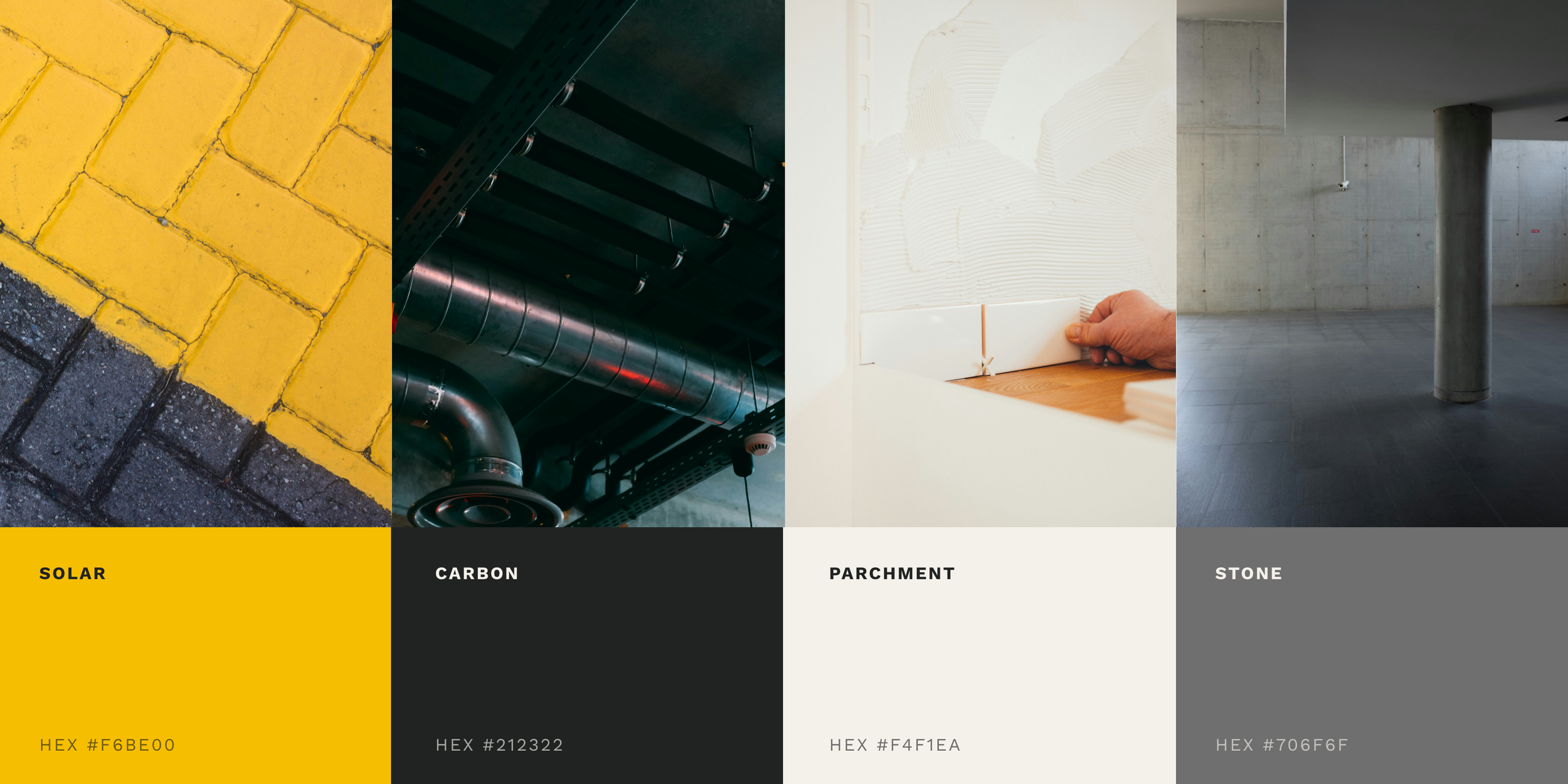
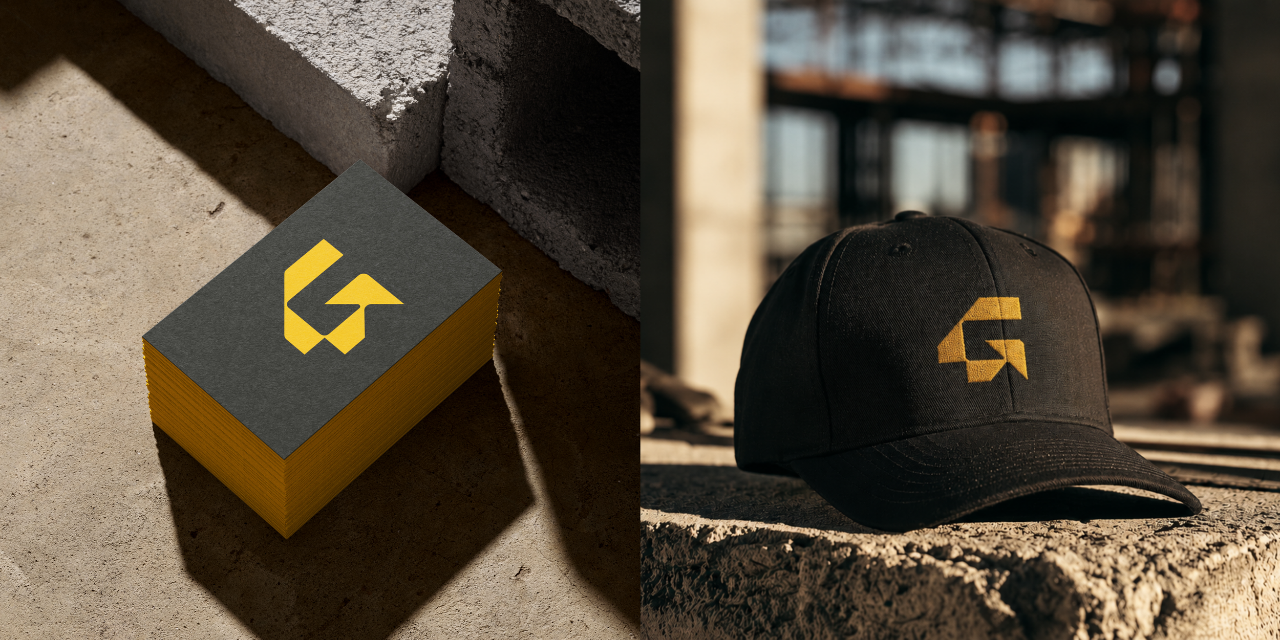
The colour palette brings together Solar, Carbon, Stone and Parchment, creating a striking visual foundation with a balance of contrast, warmth and versatility. Supporting colour variations and considered logo applications allow the identity to work consistently across both digital and print materials.
The result is a distinctive identity that gives Gilbertson Group its own recognisable presence while establishing a visual connection to the wider Gilbertson brand family.
Visual identity developed as an independent design partner to Everlign Social.